Living Room Paint Colors Benjamin Moore: Transform Your Space with Stunning Shades
Living Room Paint Colors Benjamin Moore: for low light, start with White Dove OC-17, Smoke 2122-40, or Wish AF-680; for small rooms, lean light and muted; for cozy neutrals, choose Wish AF-680 or White Dove OC-17; for accent walls, use a deeper tone like Black Raspberry 2072-20. The safest choice still depends on light, adjoining finishes, and how the color shifts from morning to night.
Benjamin Moore’s Aura Interior is positioned as a premium interior paint line, which matters in living rooms because finish quality can influence how evenly subtle colors read across changing daylight. For color selection, start with the room first, then narrow the list using the brand’s color samples, swatches, and collection structure before you commit.
How to choose by room light
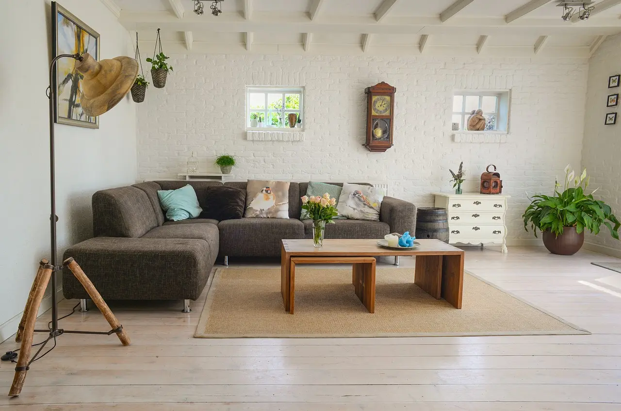


Benjamin Moore’s living room guidance says to start with the room’s lighting first. That matters because the same paint can read cooler, warmer, or flatter as daylight shifts, and the effect changes again once lamps are on. A color that works in one exposure can miss in another.
North-facing living rooms
North light is cool and often dimmer, so many colors read grayer than expected. In these rooms, choose soft warm neutrals or muted colors with enough body to keep walls from looking thin. White can work, but a crisp white often feels harsher than it looks on a fan deck. (Wikipedia)
Good starting points include White Dove OC-17 for a soft anchor, Wish AF-680 for a warmer gray-beige, and a muted blue-gray such as Smoke 2122-40 if you want calm without weight. Avoid very cool whites and icy grays unless the room has strong artificial light at night.
South-facing living rooms
South light is often brighter and warmer. Benjamin Moore notes that southern or western exposure may call for cooler hues, because warm sunlight can push beige, cream, and yellow-based colors too far into gold. That can be pleasant, but it can also make a room feel hot or over-saturated.
For south-facing rooms, cooler neutrals and restrained blues usually hold up better. Smoke 2122-40 and Gossamer Blue 2123-40 both help balance warmth. If you want a neutral wall that still feels grounded, White Dove OC-17 can work, but pair it with cooler fabrics, stone, or trim so the room does not drift too warm.
East and west light shifts
East light is brighter in the morning and softer later. West light does the reverse, often turning golden and intense in late afternoon. That swing is where many paint choices fail, because a color that looks calm at noon can feel muddy at dusk or too bright by breakfast.
For these rooms, sample any candidate on more than one wall. Benjamin Moore’s sample guidance recommends viewing samples over a few days, and that is especially useful here. Pick colors that keep their shape under changing light, not just colors that look good at one hour.
Best Benjamin Moore colors by goal
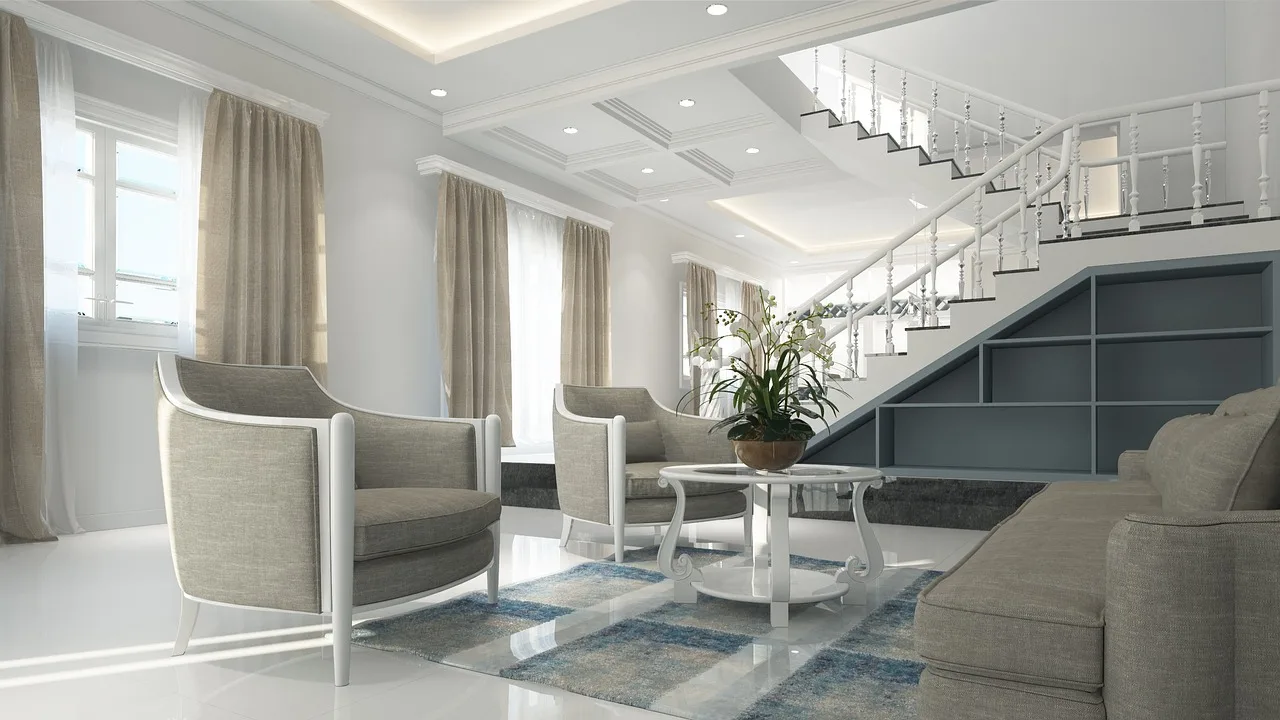
The best room paint is the one that fits the mood you want and the light you have. Benjamin Moore offers 3,500+ colors, plus Color Collections that narrow the search. Start with the room first, then the color name.
Calm neutrals for a quiet room
White Dove OC-17 is a classic light anchor for living rooms that need a soft neutral. It suits trim-heavy rooms, rooms with mixed furniture, and spaces where you want the walls to recede. Wish AF-680 works well when you want more warmth than white but less color than a true hue.
Smoke 2122-40 is another strong candidate. Benjamin Moore presents it as a calming, enveloping blue-gray for a small living room, and it can read as a neutral when the rest of the room stays simple. It is useful when you want softness without a beige cast.
Soft color for a warmer feel
Gossamer Blue 2123-40 brings a lighter, airier living room mood. It works best when the room has enough daylight to keep it from going dull, and when you want color that still feels easy to live with. It can be a better fit than beige if the furniture is already warm-toned.
For a more grounded look, Wish AF-680 can bridge warm woods, tan leather, and cream upholstery. It is from the Affinity Color Collection, which Benjamin Moore describes as 144 colors designed to mix and match. That makes it useful in open-plan homes with more than one adjoining finish.
Bold choices for an accent wall
A painted accent wall can add a focal point when a room needs direction. An accent wall approach is commonly used for bringing attention to a fireplace wall, media wall, or the side of a long room. Black Raspberry 2072-20 is a vivid option when you want more contrast and depth.
Use bold color where the room can support it. A deep accent behind a sofa can look right in a bright room, but the same shade can feel heavy in a low-light room with little natural reflection. Keep the other walls lighter so the room does not close in.
Living room color shortlist
If you want fast direction, start with this four-color shortlist. It covers the most common living room needs: soft white, calm blue-gray, warm neutral, and airier blue. Each one solves a different room problem.
- White Dove OC-17 — best for a soft, classic anchor in mixed light.
- Smoke 2122-40 — best for calm blue-gray walls in smaller rooms.
- Wish AF-680, best for a gray-beige neutral that works with warm finishes.
- Gossamer Blue 2123-40, best for a lighter, fresher mood in daylight.
Say your living room is 12 by 14 feet with one north window and a tan sofa. White Dove may keep it brighter, but Smoke can give the room more shape if the white would feel flat. That tradeoff is why room conditions matter more than color names.
Color matrix
This matrix ranks 12 living room colors numerically for low, balanced, and bright light, plus cozy, calm, and airy mood. Lower risk means fewer surprises across changing light, but even the safest color still needs a sample on your own walls.
| Color | Low light | Balanced light | Bright light | Cozy | Calm | Airy | Risk level | Best use |
|---|---|---|---|---|---|---|---|---|
| White Dove OC-17 | 5 | 4 | 3 | 4 | 5 | 4 | 1 | Classic walls, trim-friendly rooms |
| Smoke 2122-40 | 4 | 5 | 3 | 3 | 5 | 3 | 2 | Small rooms, quiet seating areas |
| Wish AF-680 | 4 | 5 | 3 | 5 | 4 | 2 | 2 | Open-plan rooms with wood tones |
| Gossamer Blue 2123-40 | 3 | 4 | 5 | 2 | 4 | 5 | 3 | Daylit rooms, lighter decor |
| Black Raspberry 2072-20 | 1 | 2 | 5 | 4 | 2 | 1 | 5 | Accent wall, art wall |
| Hazy Skies 2040-50 | 3 | 4 | 4 | 2 | 5 | 4 | 3 | Casual living rooms |
| Pale Oak OC-20 | 5 | 4 | 2 | 4 | 4 | 3 | 2 | Warm minimal rooms |
| Classic Gray OC-23 | 4 | 5 | 3 | 3 | 4 | 3 | 3 | Rooms with mixed finishes |
| Gray Owl OC-52 | 3 | 4 | 5 | 1 | 4 | 4 | 3 | Modern rooms with cooler furnishings |
| Oxford Gray 2128-40 | 1 | 3 | 5 | 3 | 3 | 1 | 5 | Accent wall, den-like living room |
| Kendall Charcoal HC-166 | 1 | 2 | 5 | 4 | 2 | 1 | 5 | Feature wall or built-ins |
| Manchester Tan HC-81 | 4 | 5 | 3 | 5 | 4 | 2 | 3 | Rooms with classic wood trim |
For fast comparisons, choose lower-risk colors when the room has limited light or a lot of fixed finishes. Choose medium-risk colors when you want more personality and can sample carefully. Reserve high-risk colors for walls that can act as a focal point rather than the whole room.
What colors make a living room look bigger?
Lighter walls usually make a room feel more open because they reflect more light and reduce visual breaks. That does not mean every small living room needs white. Homes & Gardens says small living rooms can feel flat when white is the default choice, so a soft neutral or muted color may work better.
Light neutrals that open the walls
White Dove OC-17 is a strong candidate when you want the room to feel larger without looking stark. Pale Oak OC-20 and Classic Gray OC-23 are also useful when you want the walls to recede but still carry a little warmth. In low light, these choices often feel more forgiving than bright white.
Soft color that avoids heaviness
Smoke 2122-40 can help a small room feel calm instead of cramped, especially when the furniture is simple and the trim stays light. A common first-timer mistake is choosing a deep gray because it looks elegant on a chip, then finding that it closes the room once it covers all four walls.
Using one color across connected rooms
If the living room opens into a hall or dining area, using the same wall color in both spaces can blur the boundary and make the whole zone feel wider. This works best when the trim stays consistent and the flooring does not fight the wall tone. The key is repetition, not sameness everywhere.
Example: if a living room opens to a narrow hallway and both spaces get weak daylight, White Dove OC-17 on both walls can keep the transition calm, while a slightly warmer trim reduces the jump between rooms. If the next room has oak floors and creamy upholstery, Wish AF-680 often flows more naturally than a cool gray.
How do you keep color flow?
Keep color flow by matching undertones across rooms before you pick a hero color. If the adjacent room has yellowed cream trim, a cool gray may look isolated. If the next room has warm oak floors, a blue-white can feel disconnected unless you balance it with other cool elements.
Match adjacent-room undertones
Look at the fixed surfaces first: flooring, cabinets, stone, fireplace surround, and the biggest sofa fabric. Warm wood tends to pair well with beige, greige, and soft whites. Cooler stone and gray upholstery can support blue-gray walls or cleaner whites.
Use trim to separate or connect spaces
Trim is your border control. White trim can sharpen a wall color and make the room feel more defined, while a softer trim color can let one room flow into the next. For a connected layout, using the same trim color throughout usually makes the transition less abrupt.
Tie in wood, fabric, and flooring
Paint should support the largest undertone in the room, not compete with it. If the sofa is taupe, the floor is red oak, and the rug has a cool gray pattern, a middle-ground color such as Wish AF-680 may keep the whole room balanced better than a stark white or a strong blue.
Example: a living room with honey oak floors, a cream sofa, and a beige hallway reads more continuous with White Dove OC-17 or Wish AF-680 than with a cool silver gray. If the adjoining dining room has slate-toned chairs and stone accents, Smoke 2122-40 can bridge the two spaces without creating a hard break.
Sampling checklist
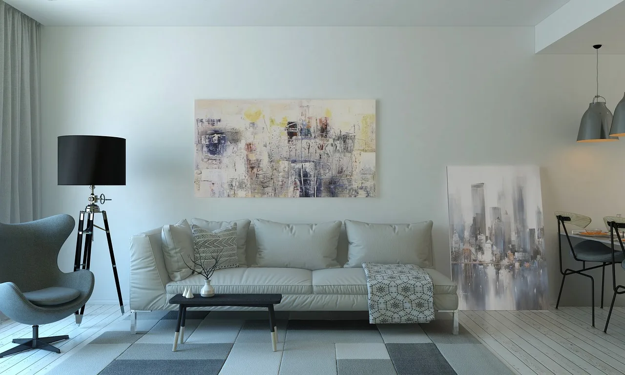
Sampling is where many good-looking colors prove themselves or fail. Benjamin Moore offers 8 oz. color samples, peel & stick samples, and color swatches, which makes it easier to compare options before committing. View each one over a few days, because living room light changes from morning to night.
- Order 2 to 4 likely colors, not a dozen.
- Get both 8 oz. color samples and peel & stick samples if you can, so you can compare a painted patch with a removable sample.
- Place samples on more than one wall, especially the wall facing the window and the wall that gets the least daylight.
- Check the samples in morning light, afternoon light, and evening lamp light.
- Watch for flattening, glare, yellow shift, and whether the color clashes with sofa fabric, wood trim, or flooring.
The sample method matters because lighting changes color appearance. A north wall may make a beige look gray by late afternoon, while a west-facing wall may warm up so much that the same beige turns creamy. Sample before painting the full room, and keep the viewing period long enough to catch those shifts.
How many samples should I test?
Test 2 to 4 colors at most. That is enough to compare a light neutral, a warmer neutral, and one stronger option without creating visual noise. More than that usually makes the decision harder, especially in a living room where furniture, rugs, and art are already changing what you see.
How should I check samples during the day?
Check samples three times: morning, afternoon, and night. Morning shows how the color behaves in cool daylight, afternoon shows its truest body, and night reveals the lamp-lit version. Put the samples on both bright and shadowed walls so you can spot color shift before painting the room.
What should I watch for when sampling?
Watch for undertone surprises, glare, flattening, and color clash with fixed finishes. A paint chip can look balanced in hand and still turn green beside oak floors or pink beside beige stone. The safest sample is one that still looks intentional next to the room’s largest surfaces.
Best living room paint finish
The best living room finish is usually an eggshell or matte finish, depending on how much durability you need and how much wall texture you want to hide. A lower-sheen finish softens light and makes subtle Benjamin Moore colors feel calmer, while a slightly higher sheen can help wipeability in active family rooms.
When a matte finish works best
Choose matte when the room gets a lot of daylight, has smooth walls, and you want color to feel soft and modern. Matte hides small imperfections better and keeps pale neutrals from looking shiny. It is especially useful with restrained colors like White Dove OC-17 or Smoke 2122-40.
When eggshell is the safer choice
Choose eggshell if the living room sees frequent use, kids, pets, or heavier traffic. It gives you a little more cleanup without looking overly reflective. In rooms with mixed lighting, eggshell often balances practicality and appearance better than a higher sheen, especially on walls with subtle color.
For trim, a cleaner white in a more durable sheen usually works well next to the wall color. That contrast helps the living room look finished without making the walls themselves too glossy. The goal is a finish that supports the color, not one that competes with it.
Frequently asked questions
What Benjamin Moore colors work best in a living room with low light?
Start with light neutrals and muted colors that hold shape without turning muddy. In low light, avoid very cool whites and very dark colors unless you only want them on an accent wall.
Should I choose a white paint for a small living room?
Not always. White can help a small room feel open, but Homes & Gardens notes that small living rooms can feel flat when white is the default choice. If the room lacks daylight or has warm furniture, a soft white or pale neutral often looks better than a bright, pure white.
Which Benjamin Moore living room colors feel cozy without making the room dark?
Wish AF-680 is a strong cozy option because it adds warmth without going heavy. Pale Oak OC-20 and White Dove OC-17 also work when you want softness, while Smoke 2122-40 gives a quieter, cooler comfort. Keep the rest of the room light so the walls do not absorb too much daylight.
What Benjamin Moore neutrals are good for living room walls?
Pick based on the undertones already in the room. Warm wood and cream fabrics usually prefer warmer neutrals; cooler stone and gray upholstery often suit cooler ones.
How do I choose a Benjamin Moore living room color by natural light?
Start with orientation. North-facing rooms usually need warmer or fuller colors; south-facing rooms often need cooler hues; east and west rooms need samples that survive major shifts through the day. Benjamin Moore recommends starting with lighting first, then sampling over a few days before choosing.
Which Benjamin Moore paint colors make a living room look bigger?
Lighter colors usually help a living room feel larger, especially when the same wall color continues into an adjacent hall or dining area. White Dove OC-17, Pale Oak OC-20, and Smoke 2122-40 can all work. Use one color family and keep trim consistent to reduce visual breaks.
Sponsored / affiliate links. As an Amazon Associate I earn from qualifying purchases. I may earn additional commission from eligible campaigns.