13 Best Paint Colors for a Study Room (Even With Low Light)
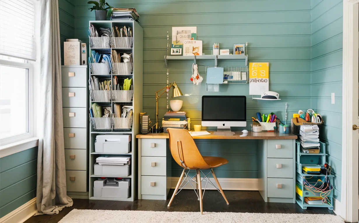
Soft blues, sage greens, and warm neutrals are the best paint colors for a study room — they support focus without the flat, sterile feel of stark white. Getting the undertone wrong in a room with little natural light can leave walls looking muddy or cold instead of calm. This guide covers 13 colors by mood (part of our full paint color ideas collection), a fix for low-light rooms using Sherwin-Williams Accessible Beige, and what real color-psychology research says about productivity.
Quick Answer
Soft blue (Sherwin-Williams Sea Salt SW 6204) or sage green boosts focus in most study rooms without feeling cold. If your room gets minimal natural light, switch to a warm neutral like Accessible Beige (SW 7036) or a warm-undertone light gray — cool blues and grays can look flat and gray without enough sunlight to balance them.
Choosing the Right Paint Color
The color of your study room or office affects mood and focus more than most people expect. Choosing well means picking a hue that helps you concentrate rather than one that just looks nice on a swatch.
A study-room paint color is a wall color chosen to support sustained focus and low eye strain, not just looks — the best options are muted, mid-value hues rather than stark white or highly saturated brights. Bright white rooms have been linked to more task errors in office-color studies, and highly saturated colors like pure red can overstimulate during long sessions.
Importance of Color
Color sets the tone of a room. It can energize or relax you, and the right choice can measurably improve focus and efficiency. A poor choice leads to distraction and restlessness — aim for balanced, mid-value tones rather than anything too bright or too dark.
Psychology of Color
Colors have documented psychological effects on emotion and behavior. Blue is associated with calm and reduced stress; green with balance and a serene workspace; yellow with creativity and optimism, though it works best sparingly since too much can be overstimulating. Always test a swatch directly on your wall first — paint often looks different once applied than it does on the sample card.
What Is the Single Best Color for a Study Room?
Soft blue is the most consistently recommended single color for a study room. It’s associated with mental clarity and lower stress in workplace color research, and it pairs with nearly any furniture tone without looking cold — the main exception is a room with very little natural light, where a warm neutral works better (see below).

Best Paint Color for a Study Room With Minimal Natural Light
Warm neutrals are the best paint choice for a study room with minimal natural light. Sherwin-Williams Accessible Beige (SW 7036) and Behr Silver Drop (790C-2) both counteract the flat, gray cast that north-facing or windowless rooms pick up under lamps and overhead fixtures alone.
Cool undertones — blue-gray, green-gray, true white — amplify the coldness of a dim room instead of brightening it. Warm undertones (yellow-, peach-, or pink-based neutrals) bounce artificial light back into the space and read warmer even without sun. The same fix applies to any small windowless room, not just a study.
Check the paint’s Light Reflectance Value (LRV) before committing — a higher LRV bounces more of your lamp and overhead light back into the room. See the Neutral Grays section below if a light gray with a warm undertone is more your style than beige.
What’s the Best Paint Color for a Study Room With Little Natural Light?
Warm neutrals like Sherwin-Williams Accessible Beige (SW 7036) or Behr Silver Drop (790C-2) work best in low-light study rooms. Cool-toned blues and grays can look flat or gray without enough sunlight to balance them, while warm undertones bounce artificial light back into the space instead of absorbing it.

Best Desk Lamp Pick for Low-Light Study Rooms
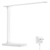
Lepro LED Desk Lamp, Metal, 800lm – $21.98
Pairs with a warm-undertone wall like Accessible Beige to fully offset a windowless or north-facing study room — 800 lumens is enough to read by without relying on overhead light alone.
- Best for: Windowless or low-light study rooms and home offices
- Why we picked it: Metal body, stable base, warm-to-cool adjustable light matches the warm-undertone paint fix above
- Main drawback: No battery backup — needs a wall outlet nearby
Compare more desk lamp options
 Option 1 cozoo LED Desk Lamp with Pen Holder – $29.99
|
 Option 2 BOHON LED Desk Lamp, 3 Color Modes – $29.97
|
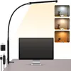 Option 3 Voncerus Clamp LED Desk Lamp – $16.98
|
As an Amazon Associate we earn from qualifying purchases.
Calming Blues
Choosing the right paint colors for your study room or office can boost productivity. One of the most effective choices is calming blues. These shades create a peaceful atmosphere, perfect for focusing on tasks.
Soft Blue Shades
Soft blue shades are ideal for creating a serene environment. They help reduce stress and promote a sense of calm. Here are some popular soft blue shades for study rooms and offices:
| Shade | Description |
|---|---|
| Sky Blue | A light and airy blue that evokes the open sky. |
| Pale Blue | A soft, muted blue that creates a gentle ambiance. |
| Powder Blue | A delicate blue with a hint of gray, very soothing. |
Benefits for Concentration
Calming blues offer numerous benefits for concentration. These colors help create a focused and distraction-free environment. Here are some key benefits:
- Reduce mental strain
- Improve focus and attention
- Create a sense of order and organization
- Lower anxiety levels
Incorporating soft blue shades into your study room or office can make a significant difference in productivity and well-being.
Energizing Greens
Green is a color that represents growth, renewal, and energy. It can create a refreshing and calming atmosphere in your study room or office. Choosing the right shade of green can help improve your focus and productivity.
Shades of Green
There are many shades of green that can energize your workspace. Here are a few popular ones:
- Mint Green: A light, fresh shade that can make a small room feel larger.
- Olive Green: A warm, earthy tone that brings a sense of stability.
- Emerald Green: A bold, vibrant color that can inspire creativity.
- Sage Green: A soft, muted green that promotes calm and concentration.
Impact on Productivity
Green has a positive impact on productivity. It reduces eye strain and creates a relaxing environment. This can help you stay focused for longer periods.
Green has also been linked to improved reading comprehension and reduced anxiety in workplace-color research.
| Shade | Impact |
|---|---|
| Mint Green | Makes rooms feel larger, boosts focus |
| Olive Green | Brings stability, reduces stress |
| Emerald Green | Inspires creativity, energizes the mind |
| Sage Green | Promotes calm, improves concentration |
Choosing the right shade of green can transform your study room or office. It can make you feel more relaxed and productive. Consider trying these shades to see their positive effects.
Neutral Grays
Neutral grays have gained immense popularity for study rooms and offices. These colors offer a calm and professional atmosphere. They are versatile, timeless, and pair well with many decor styles. Whether you’re aiming for a modern or classic look, neutral grays can help create a productive environment. See our full Sherwin-Williams gray shade comparison for exact LRV values if you want a specific gray that still bounces light well.
Popular Gray Tones
Several shades of gray work well in study rooms and offices. Light gray tones, like dove gray, give a soft and airy feel. Medium grays, such as pewter, offer a balanced and neutral backdrop. Darker grays, like charcoal, provide depth and a touch of sophistication. Each tone has its unique appeal and can influence the room’s ambiance.
Creating a Balanced Environment
Neutral grays help in creating a balanced environment. They reduce distractions and promote focus. Pairing gray walls with white trim or wooden furniture creates an elegant contrast. Add pops of color through accessories to keep the space lively and engaging. Incorporating different textures can also enhance the room’s aesthetic and make it more inviting.
Warm Yellows
Choosing the right color for your study room or office can boost productivity. One fantastic option is warm yellows. These shades create a cheerful and energizing atmosphere.
Yellow Variations
Not all yellows are the same. There are many yellow variations to consider:
- Soft buttery yellow
- Bright sunflower yellow
- Rich golden yellow
Each variation has its own unique impact on your mood and productivity. For a calming effect, choose soft buttery yellow. For a more dynamic feel, bright sunflower yellow works best. Rich golden yellow offers a luxurious, cozy atmosphere.
Stimulating Creativity
Warm yellows are known to stimulate creativity. This color can spark new ideas and enhance mental clarity. Use warm yellows in areas where you need to brainstorm, but keep it to an accent wall — research on office color found yellow can increase anxiety when it dominates an entire room.
Warm yellows can also make small spaces appear larger, which is useful for home offices or study nooks. Combine warm yellows with natural light for the best effect, and balance with neutral tones to avoid overwhelming the space.
Sophisticated Whites
Choosing the right paint color for your study room or office is crucial. One popular choice is sophisticated whites. These shades create a clean, crisp environment and pair with almost any furniture or decor style.
White Shades
White comes in many shades, each with its own unique charm. Here are some popular white shades:
- Pure White
- Off-White
- Ivory
- Antique White
- Snow White
These shades are versatile and can easily match any decor. They create a serene, spacious feel, and they make the room look larger by reflecting light.
The Catch With All-White Rooms
Use white with caution as the sole wall color. Office-color research has linked all-white rooms to more short-term task errors than colored rooms, regardless of the worker’s personality type. Pair white with a warm wood desk, a patterned rug, or one accent wall in a muted color rather than leaving every surface stark white.
Bold Reds
Bold reds can transform your study room or office. They create a dynamic and energetic environment. This color is perfect for spaces where you need to stay alert and focused. Here’s why bold reds might work for boosting productivity — and who they work best for.
Red Hues
Bold reds come in various shades. Cherry red, crimson, and scarlet are just a few examples. Each hue has its own unique vibe. Choose a shade that resonates with your style. Lighter reds can feel more cheerful, while darker reds can add a touch of sophistication.
Boosting Energy Levels
Red is known for its ability to boost energy levels. This color can make you feel more awake and alert. It stimulates the brain and increases heart rate, which can help with tasks that require attention to detail over long work or study sessions. Red tends to work best as an accent wall rather than covering the full room — see the research callout below on who red actually works best for.
📊 A University of Texas study of 90 office workers (led by Dr. Nancy Kwallek) found that “high screeners” — people better able to tune out their surroundings — were more productive in red rooms, while “low screeners” were more productive and found blue-green rooms more relaxing. All-white rooms produced more short-term task errors regardless of personality type. — Source: Sherwin-Williams, citing University of Texas research
“There are great variations in sensitivity to one’s surroundings” — no single paint color is the universal best choice for every worker’s focus.
Earthy Browns
Earthy browns create a warm and inviting atmosphere. These tones bring a sense of stability and comfort to any space. Perfect for study rooms and offices, earthy browns help maintain focus and productivity.
Brown Tones
Brown tones range from light beige to deep chocolate. They blend well with other colors. This versatility makes them ideal for various design styles. Brown tones can make a room feel cozy and grounded.
Enhancing Stability
Earthy browns enhance stability and create a balanced environment. These shades promote concentration and reduce distractions. A stable atmosphere is essential for productivity. Earthy browns can help achieve this stability in your study room or office.
Soft Pinks
Soft pinks can transform a study room or office into a serene workspace. These gentle hues create a calming atmosphere, enhancing productivity and focus. Many people find soft pinks inspiring and soothing. Here’s how soft pinks can make your study or office a more productive environment.
Pink Palettes
A variety of pinks can suit different tastes and needs. From blush to pastel, each shade offers unique benefits. Light pinks can open up a small room, making it feel spacious. Rosy tones add warmth without being overwhelming. Selecting the right shade can be crucial for achieving the desired effect. Experiment with different pink palettes to find your ideal color.
Creating Calmness
Soft pinks have a natural ability to calm the mind. This can be especially helpful in a study or office setting. A relaxed mind is more focused and productive. Gentle pinks reduce stress, making it easier to concentrate on tasks. The subtlety of soft pinks ensures they are not distracting. Instead, they provide a tranquil background that supports work and study.

Vibrant Oranges
Vibrant oranges can significantly boost productivity in study rooms and offices. This energetic color not only brightens the space but also stimulates creativity and enthusiasm. Here’s how different shades of orange can transform your workspace.
Orange Shades
Orange comes in many shades, each bringing a unique vibe. Lighter shades like peach can create a calm yet lively atmosphere. Deeper hues like burnt orange add a touch of sophistication while maintaining energy. Choose a shade that best matches your desired mood and aesthetic.
Encouraging Enthusiasm
Orange is known to encourage enthusiasm and motivation. It can make you feel more excited and ready to tackle tasks. This makes it a great choice for study rooms and offices. The vibrant color can help maintain high energy levels throughout the day.
Consider pairing orange with neutral colors. This can balance the vibrant energy and prevent it from becoming overwhelming. Whether you opt for a bold accent wall or subtle orange decor, the right shade can significantly enhance your productivity and mood.
Minimalist Blacks
Choosing the right paint color for your study room or office can greatly affect your productivity. Minimalist blacks are an excellent choice for those who seek a modern and sleek look. These shades can add a touch of sophistication while promoting focus and concentration.
Black Accents
Using black accents in your study room can create a bold and stylish environment. Black accents can be introduced in various ways:
- Black furniture
- Black trim on walls
- Black shelves
These elements can make your space feel more cohesive and polished. Black accents work well with various other colors, making it easy to mix and match.
Adding Depth
Black paint can add depth to your study room or office. Darker shades create a sense of space and can make a room feel more intimate. To achieve this, consider the following:
- Paint one wall black to create a focal point.
- Use black on the lower half of the walls with a lighter color on top.
- Incorporate black textures such as matte or glossy finishes.
These techniques help in adding depth without overwhelming the space. Black can be paired with lighter colors to balance the overall look. For those who prefer a minimalist style, black is a versatile choice for increasing productivity — just avoid it in a room that already gets little natural light, since dark walls absorb what light you do have.
Muted Purples
Choosing the right paint color for your study room or office is crucial. Muted purples are an excellent option. They provide a calming and creative atmosphere.
Purple Variants
Muted purples come in various shades. Each has its unique touch. Here are some popular variants:
| Shade | Description |
|---|---|
| Lilac | Soft and light, perfect for a serene space. |
| Mauve | A bit darker, adding a touch of elegance. |
| Lavender | Gentle and soothing, great for reducing stress. |
| Plum | Rich and deep, ideal for a sophisticated look. |
Inspiring Creativity
Muted purples are known to inspire creativity. These shades help stimulate the mind. They encourage innovative thinking.
- Lilac: Boosts imagination with its light and airy feel.
- Mauve: Helps in focusing by creating a balanced environment.
- Lavender: Reduces anxiety, making it easier to think clearly.
- Plum: Adds depth, fostering deep thought and concentration.
Choosing muted purples can transform your workspace. They offer a blend of calmness and creativity, perfect for anyone aiming to enhance productivity.
Compare Paint Colors by Goal
| Color Family | Best For | Watch Out For |
|---|---|---|
| Blue | Deep focus, calm, most furniture styles | Can feel cold in a room with little natural light |
| Green | Long reading sessions, reduced eye strain | Olive and darker shades can feel heavy in a small room |
| Warm Neutral (Beige/Greige) | Rooms with minimal natural light | Can look flat if the LRV is too low |
| Yellow | Creative brainstorming, accent walls | Overstimulating and can raise anxiety in large doses |
| Gray | Modern, professional look | Needs a warm undertone in dim rooms or it reads cold |
Custom Combinations
Creating a productive study room or office involves more than just choosing the right furniture. The paint colors you select can significantly impact your focus and mood. Custom combinations of colors can elevate your workspace and boost productivity.
Mixing Colors
Mixing colors allows you to create a unique environment. Consider using a base color with pops of accent colors. For example, a soft gray base with bright yellow accents can energize the room. Combining calming blues with stimulating oranges also creates a balanced atmosphere.
Think about the psychological effects of colors. Blues and greens promote calmness and concentration. Reds and yellows can stimulate creativity and energy. By mixing these colors, you can tailor the environment to your needs.
Personalizing Your Space
Personalizing your space makes it more inviting and motivating. Choose colors that reflect your personality and preferences. If you love nature, greens and browns might be ideal. For a modern look, try combining white with sleek black accents.
Incorporate your favorite colors in subtle ways through artwork, small decor accents, or a framed photo on the desk. This approach ensures the space feels uniquely yours without repainting the whole room every time your taste changes.
Remember, the goal is to create a space that enhances your productivity and comfort. Custom color combinations help you achieve that by making the room more appealing and functional.

Frequently Asked Questions
What Are the Best Colors for a Study Room?
The best colors for a study room include blue, green, and white. These colors promote focus and calmness, though white works best paired with a warm wood tone or an accent color rather than covering every wall.
How Does Color Affect Productivity?
Colors like blue and green enhance focus and efficiency, while warm colors like yellow and orange can boost creativity and energy. Individual sensitivity to surroundings varies, so there’s no single color that works best for every person.
Is White a Good Color for an Office?
White creates a clean, uncluttered look, but an all-white office has been linked to more short-term task errors in workplace-color research. Use white with a warm wood desk or one accent wall rather than as the only color in the room.
Can Paint Colors Improve Concentration?
Yes, certain paint colors like blue and green can improve concentration and productivity in a study room by reducing visual distraction and mental strain compared to stark white or highly saturated brights.
What’s the Best Paint Color for a Study Room With Little Natural Light?
Warm neutrals like Sherwin-Williams Accessible Beige (SW 7036) or Behr Silver Drop (790C-2) work best in low-light study rooms. Cool-toned blues and grays can look flat or gray without enough sunlight to balance them, while warm undertones bounce artificial light back into the space instead of absorbing it.
What Color Should You Avoid in a Study Room?
Avoid stark all-white walls and highly saturated pure red or bright yellow as the dominant color. Research on office color found all-white rooms produced more task errors, and oversaturated warm colors can overstimulate rather than energize during long focus sessions. Use bold colors as an accent wall, not the full room.
Conclusion
Soft blues and sage greens are the safest picks for most study rooms, warm neutrals like Accessible Beige fix a room with little natural light, and stark all-white walls are the one choice the research actually argues against. Test any color directly on your wall, in your room’s actual lighting, before committing to a full repaint.
Sponsored / affiliate links. As an Amazon Associate I earn from qualifying purchases. I may earn additional commission from eligible campaigns.
 Halobios Acrylic Paint Set 36 Colors, Premium Acrylic Paints for Students & Adults, With Fluorescent Colors & Metallic Colors for Painting, Drawing & Art Supplies, DIY Arts and Crafts
 Halobios Acrylic Paint Set 50 Colors(2 fl oz/60 ml), Premium Acrylic Paints for Kids & Adults, With Fluorescent Colors & Metallic Colors for Painting, Drawing & Art Supplies, DIY Arts and Crafts