
8 Paint Color Schemes for Your Home – What to Pick? Expert Tips
Choosing the right paint color for your home can be tricky. With so many options, where do you start?
Paint colors shape the vibe of your home. They can make rooms feel bigger, cozier, or even more cheerful. The right color scheme can transform your space and reflect your personality. But with endless choices, picking the perfect palette can feel overwhelming.
This blog post will guide you through eight stunning paint color schemes. You will find inspiration and tips to help you decide. Whether you’re updating one room or your entire house, these ideas will spark your creativity. Dive in and discover the perfect colors for your home!
Choosing The Right Color Scheme
Picking the perfect color scheme for your home can be a daunting task. It sets the mood and tone for your entire living space. A well-chosen palette can make a room feel warm and inviting or cool and calming. Here’s a guide to help you choose the right color scheme for your home.
Importance Of Color In Home Design
Colors have a profound impact on how we feel in our homes. They can influence our mood, energy levels, and even our sense of space. For example, light colors can make a room feel larger and more open, while dark colors can create a cozy, intimate atmosphere.
A harmonious color scheme can tie different elements of a room together, creating a cohesive look. Contrasting colors can add visual interest and highlight key features. Understanding the importance of color in home design helps you make informed choices.
Factors To Consider
Several factors can influence your choice of color scheme. Here are some key considerations:
- Room Size: Lighter colors can make small rooms feel larger.
- Natural Light: Rooms with ample natural light can handle darker shades.
- Existing Decor: Consider the colors of your furniture and accessories.
- Personal Preference: Choose colors that make you feel comfortable and happy.
Another important factor is the room’s purpose. For instance, bedrooms benefit from soothing colors like blues and greens. Kitchens and dining areas might be better with warmer tones like reds and yellows. Considering these factors ensures your color choices enhance your home’s functionality and aesthetics.
Table: Color Schemes And Their Effects
| Color Scheme | Effect | Best For |
|---|---|---|
| Monochromatic | Unified, serene | Bedrooms, bathrooms |
| Analogous | Harmonious, varied | Living rooms, kitchens |
| Complementary | Dynamic, vibrant | Accent walls, feature areas |
| Triadic | Balanced, colorful | Playrooms, creative spaces |
Choosing the right color scheme is essential for creating a home that reflects your style and meets your needs. Consider the importance of color, key factors, and the effects of different schemes to make the best choices for your space.
Neutral Tones
Choosing paint colors for your home can be challenging. If you’re unsure where to start, consider neutral tones. They provide a timeless and versatile foundation for any room. Below, we explore the benefits of neutrals and the best rooms for neutral colors.
Benefits Of Neutrals
- Timeless Appeal: Neutral colors never go out of style. They blend well with various decor styles.
- Versatility: Neutrals work well with other colors. They offer flexibility in decorating.
- Calming Effect: Soft neutral shades create a serene environment. They are perfect for relaxation.
- Easy to Update: Change your decor without repainting. Neutrals adapt to new trends easily.
Best Rooms For Neutral Colors
| Room | Recommended Neutral Shade |
|---|---|
| Living Room | Warm Beige |
| Bedroom | Soft Gray |
| Kitchen | Creamy White |
| Bathroom | Light Taupe |
Living Room: Use warm beige for a cozy feel. It makes the space inviting.
Bedroom: Soft gray promotes relaxation. It’s perfect for restful sleep.
Kitchen: Creamy white offers a clean, fresh look. It brightens the space.
Bathroom: Light taupe creates a spa-like atmosphere. It’s calming and elegant.
Bold And Vibrant Colors
Bold and vibrant colors can transform a dull space into a lively one. These colors bring energy and personality to any room. They create a focal point and add character. Whether you like red, blue, or yellow, bold colors make a statement. But how do you use them effectively in your home?
Creating Impact With Bold Colors
Bold colors draw attention and create a strong visual impact. Use them on accent walls to highlight architectural features. A bright red wall can make a living room feel cozy and warm. Deep blue in a bedroom can add a touch of elegance. Bold colors also work well in small spaces. They can make a bathroom or hallway feel more interesting. Use bold colors to create a mood. Warm colors like orange and yellow feel inviting. Cool colors like green and blue feel calm.
Pairing Bold Colors
Pairing bold colors can be tricky. Choose complementary colors that balance each other. For example, pair a bright yellow with a deep blue. This combination creates a vibrant and balanced look. You can also pair bold colors with neutrals. A bold green wall with white furniture looks fresh and modern. Mix bold colors with patterns. A bold red wall pairs well with a patterned rug. This adds depth and interest to the room. Remember to keep the balance. Too many bold colors can feel overwhelming.

Credit: jp.pinterest.com
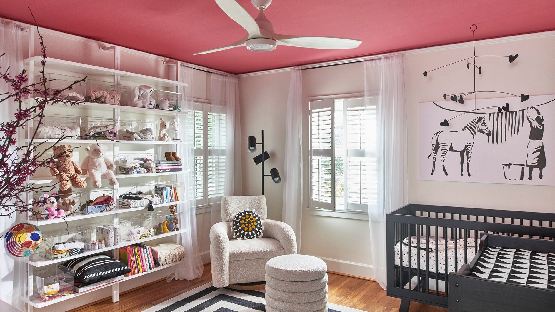
Pastel Shades
Discover the charm of pastel shades in your home. Choose from eight soothing paint color schemes to create a serene atmosphere.
Pastel shades offer a delicate and inviting feel to any home. They are light, soft colors that can make rooms feel more open and airy. Pastels can create a tranquil atmosphere and are perfect for those who prefer a subtle touch of color. Let’s explore how these shades can transform your living spaces.Soft And Calming Effects
Pastel shades like baby blue, mint green, and soft pink are known for their calming effects. They help create a serene environment, perfect for bedrooms and living areas. These shades can reduce stress and promote relaxation. Using pastels in spaces where you unwind can make a big difference. Imagine a bedroom with walls painted in a soothing lavender or a nursery with pale yellow accents. These colors are not only pleasing to the eye but also help to create a peaceful retreat from the hustle and bustle of daily life.Popular Pastel Combinations
Combining pastel shades can create a cohesive and stylish look. Here are some popular pastel combinations that can elevate the aesthetic of your home:| Combination | Description |
|---|---|
| Mint Green & Peach | Fresh and inviting, perfect for kitchens and bathrooms. |
| Lavender & Pale Pink | Romantic and gentle, ideal for bedrooms and living rooms. |
| Baby Blue & Soft Yellow | Cheerful and calming, great for nurseries and playrooms. |
| Blush & Light Gray | Elegant and sophisticated, suitable for any room. |
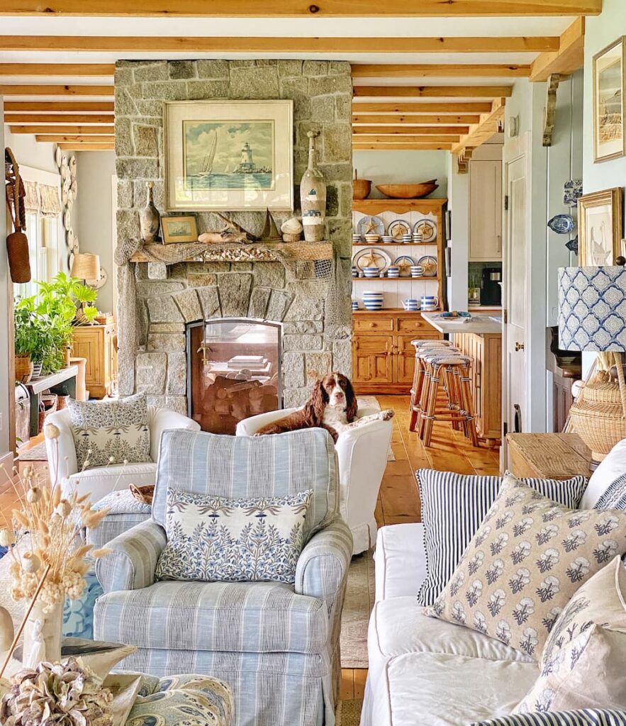
Earthy Hues
Earthy hues are the perfect choice for those seeking a natural feel. These colors draw inspiration from nature, creating a warm and inviting atmosphere. Think of the colors you find in the forest, desert, or mountains. They bring a sense of calm and stability to any room.
Warmth Of Earthy Colors
Earthy colors include shades of brown, green, and beige. These hues mimic the natural world. They can make your home feel cozy and welcoming. Browns remind us of the soil and trees. Greens reflect the freshness of plants. Beiges provide a neutral backdrop.
Using these colors can transform your home. It can feel like a retreat in nature. These tones are also versatile. They work well in both modern and traditional settings. They blend easily with other colors and materials. This makes them a popular choice for many homeowners.
How To Use Earthy Tones
Start with the walls. Paint them in a soft beige or muted green. These colors create a soothing base. Then, add deeper shades of brown for accents. Think furniture, rugs, or artwork. These elements will stand out against the lighter walls.
Don’t forget about natural materials. Wood, stone, and linen complement earthy hues. Use wooden furniture or stone countertops. These materials enhance the natural feel. Finally, add some plants. They bring life and color to the space. They also tie in the natural theme.

Credit: www.tricopainting.com
Monochromatic Schemes
Monochromatic schemes are a popular choice for home interiors. They use one color in various shades, tints, and tones. This creates a cohesive and calming look. It’s perfect for those who love simplicity and elegance. Monochromatic designs are easy to execute and offer a sophisticated result.
Advantages Of Monochrome
Monochromatic schemes provide a clean and sleek look. They make spaces feel larger and more open. Using one color in different shades adds depth and interest. It’s also easy to match furniture and decor with a monochromatic palette.
Monochrome designs are versatile. They work well in any room, from bedrooms to kitchens. They create a calm and serene environment. This makes them ideal for spaces meant for relaxation.
Tips For Monochromatic Design
Start with a base color you love. Use different shades of this color for walls, furniture, and decor. Add variety with textures and patterns. This prevents the space from looking flat.
Mix light and dark shades to create contrast. This adds dimension to the room. Use accent pieces in varying tones of the same color. This creates visual interest without overwhelming the space.
Consider the room’s lighting. Natural light can change how colors appear. Test paint samples on your walls. Observe them at different times of the day. This ensures you choose the right shades.
Incorporate different materials like wood, metal, or fabric. This adds texture and keeps the design from being too monotonous. Balance is key in monochromatic designs.
Cool And Soothing Colors
Cool and soothing colors create a calm, peaceful atmosphere. These shades typically include blues, greens, and purples. They can transform a hectic home into a serene retreat. Let’s explore their benefits and best uses.
Benefits Of Cool Tones
Cool colors have several benefits for your home. They can make a room feel more spacious. These shades are often associated with relaxation and tranquility. Here are some key benefits:
- Relaxation: Cool tones promote a sense of calm.
- Spaciousness: Light cool colors can make rooms appear larger.
- Focus: Ideal for study areas, enhancing concentration.
- Balance: These colors balance bright, warm tones in your home.
Best Uses For Cool Colors
Cool colors can be used in various parts of your home. Each area can benefit from a touch of these soothing hues. Here are some ideas:
- Bedrooms: Blues and greens create a serene sleep environment.
- Bathrooms: Light blue or aqua provides a spa-like feel.
- Home Offices: Soft greens promote focus and calm.
- Living Rooms: Use cool tones to create a relaxing space.
Choosing the right paint color can transform your home. Cool and soothing colors offer many benefits and can be used creatively in various spaces. Embrace these hues to create a calm and inviting atmosphere.
Credit: mollyinmaine.com
Accent Walls
Accent walls can change the look of a room. They add depth, warmth, and a pop of color. An accent wall is a single wall painted a different color from the other walls in the room. This creates a focal point that draws the eye.
Choosing The Right Accent Color
Choosing the right accent color is vital. It should complement the existing colors in the room. Here are some tips:
- Contrast: Pick a color that contrasts with the room’s primary color.
- Mood: Think about the mood you want to create. Calm colors like blue for relaxation. Bold colors like red for energy.
- Room Size: Light colors make a room feel bigger. Dark colors make it feel cozy.
Placement Of Accent Walls
Placement of accent walls is just as important as color. Here are some guidelines:
- Focal Point: Choose the wall that naturally draws attention. This could be behind a bed, couch, or fireplace.
- Symmetry: Ensure the accent wall balances the room. Avoid walls with many windows or doors.
- Lighting: The wall should be well-lit. Natural or artificial light can highlight the accent wall.
| Room | Suggested Accent Wall |
|---|---|
| Living Room | Behind the main sofa |
| Bedroom | Behind the headboard |
| Dining Room | Behind the dining table |
Expert Tips For Choosing Paint Colors
Choosing the right paint colors for your home can be challenging. Experts suggest a few key strategies to make the process easier. These tips will help you select colors that enhance your space and reflect your style.
Testing Colors
Always test paint colors before committing. Buy small samples of your chosen shades. Paint large swatches on your walls. Observe them at different times of the day. This helps you see how the colors change with light.
Lighting Considerations
Lighting greatly affects how paint colors look. Natural light shows the truest color. Artificial lighting can change the tone. Warm lighting makes colors appear warmer. Cool lighting makes colors look cooler. Consider your room’s lighting when choosing paint colors.
Frequently Asked Questions
What Are Popular Paint Color Schemes For Homes?
Popular paint color schemes include neutral tones, pastels, bold colors, and monochromatic palettes. These options provide flexibility and can match various interior styles.
How Do I Choose A Paint Color Scheme?
Consider your home’s style, lighting, and existing furniture. Test small samples on your walls to see the effect.
What Colors Make A Room Look Bigger?
Light colors like white, beige, and light gray can make a room appear larger. They reflect more light.
Can I Use Bold Colors In Small Rooms?
Yes, you can use bold colors in small rooms. Balance with neutral accents to avoid overwhelming the space.
Conclusion
Choosing the right paint color can transform your home. Experiment with different shades. Consider the mood you want to set. Neutral tones offer timeless elegance. Bold colors add a touch of excitement. Light colors can make rooms feel spacious. Dark hues create coziness.
Mix and match to suit your style. Remember, your home reflects your personality. Take your time and enjoy the process. Happy painting!