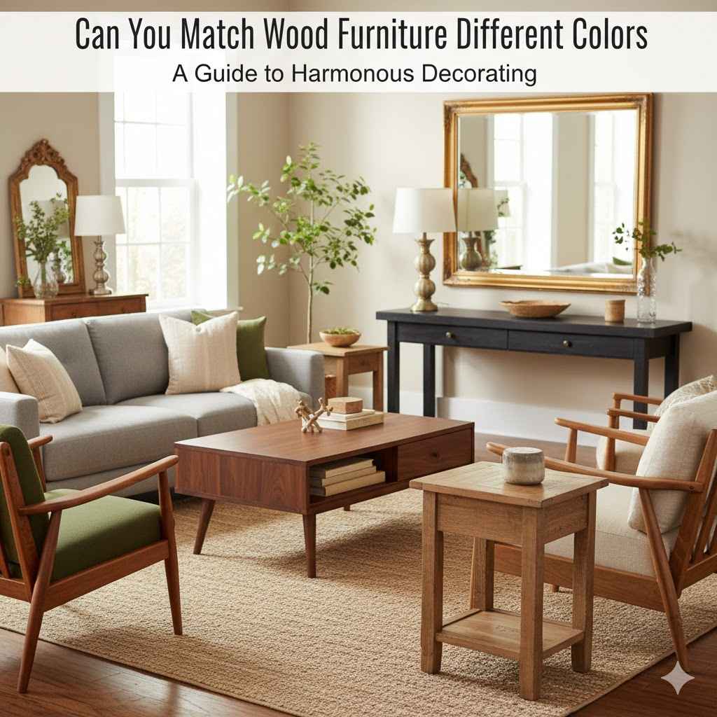
Can You Match Wood Furniture Different Colors
Deciding how to mix and match wood furniture colors can feel tricky, especially if you’re just starting to decorate your home. Many people wonder, Can You Match Wood Furniture of Different Colors? It seems like a puzzle. You want your rooms to look nice, but you worry about clashing shades.
Don’t worry, it’s easier than you think! We’ll walk through it step-by-step to make your space look great without any stress. Get ready to learn simple ways to blend different wood tones for a beautiful home.
Achieving Harmony With Mixed Wood Tones
Mixing wood furniture colors is a popular design choice that adds warmth and personality to any room. It moves away from the old rule of matching everything perfectly and opens up a world of design possibilities. This approach can make a space feel more layered and interesting.
When done right, mismatched wood tones can create a visually appealing and inviting atmosphere. The key is to understand how different wood finishes interact and to use a few simple guidelines to bring it all together.
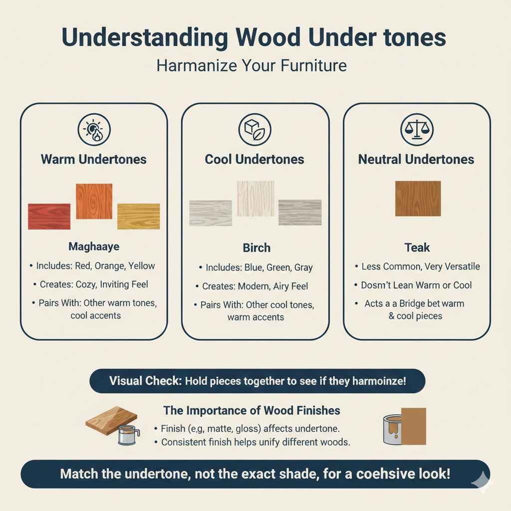
Understanding Wood Undertones
Wood furniture isn’t just one shade; it has underlying colors, called undertones. Knowing these helps you pick pieces that work well together, even if their main colors are different. Think of it like picking paint colors; you need to know if they lean warm or cool.
This is a key step in making different wood tones look intentional, not accidental. It helps create a cohesive look.
Warm undertones include red, orange, and yellow. Woods like cherry, mahogany, and some oak finishes often have warm undertones. These woods bring a cozy, inviting feeling to a room.
They pair well with other warm-toned woods or can be balanced with cooler elements in your decor. If you see golden or reddish hues in the wood, it’s likely warm.
Cool undertones include blue, green, and gray. Woods like ash, birch, and some pine or maple finishes often display cool undertones. These woods can give a room a more modern or airy feel.
They can be combined with other cool woods or softened with warm accents. If the wood looks slightly gray or has a hint of blue, it’s probably cool.
Neutral undertones are less common but exist. These woods don’t strongly lean warm or cool. They are very versatile and can often be mixed with a wider range of wood tones.
Walnut and some teak finishes can sometimes fall into this category. They act as a good bridge between warm and cool pieces.
When you look at wood furniture, try to identify these undertones. Hold a piece of wood near another and see if they seem to harmonize or clash. This visual check is more important than the exact shade of brown.
It’s a skill that gets easier with practice. You’ll start to notice these subtle differences everywhere.
The Importance of Wood Finishes
Beyond the wood’s natural color and undertone, the finish plays a huge role in how it looks and blends. Finishes can add color, shine, or texture. They can make similar woods look very different.
So, two pieces of oak might look mismatched if one has a dark, glossy finish and the other has a light, matte one.
Glossy finishes reflect a lot of light. This can make a piece stand out. It might make lighter woods seem brighter and darker woods richer.
High gloss finishes can feel more modern and formal. They might draw attention to a piece, so consider this if you want a subtle look.
Matte or satin finishes absorb light. They tend to look more natural and can help wood tones blend together more easily. These finishes often feel more casual and relaxed.
They are a great choice when you want to mix several wood types without one dominating the space. This is because they don’t create strong reflections.
Stained finishes alter the wood’s color. A dark stain can make lighter woods look richer. A whitewash finish can mute darker woods.
The stain color itself is important. A reddish stain on one piece and a yellowish stain on another will create contrast. Always consider the color the stain adds, not just the wood underneath.
Painted finishes completely cover the wood. A painted piece, like a white dresser or a black table, acts as a neutral element. It can bridge the gap between different wood tones.
You can have multiple wood colors and a painted piece to tie them together. The color of the paint is the key factor here.
Let’s consider two pieces of furniture. A rustic pine table with a clear, matte finish might look very different from a cherry wood desk with a high-gloss, dark red stain. Even though both are wood, their finishes make them appear quite distinct.
The matte pine feels natural, while the glossy cherry feels more polished and dramatic. This difference in finish is crucial for how they will interact in your room.
Creating a Visual Hierarchy
When you mix wood furniture, think about creating a visual hierarchy. This means having a dominant wood tone or style and then supporting pieces. You don’t want every single item to shout for attention.
Having a main wood piece, like a sofa table or a coffee table, and then using other wood tones for smaller items like end tables or decorative accents can work well.
A common way to create hierarchy is by size and placement. A large dining table made of a specific wood can be the main focus. Then, chairs made of a slightly different wood, or even painted chairs, can complement it without competing.
This keeps the eye moving around the room in a pleasant way.
Another method is to use the main wood tone in larger pieces of furniture. For example, a large, dark walnut bookshelf could be the anchor. Then, you can introduce lighter wood end tables or a distressed wood accent chest.
This establishes the walnut as the primary wood and the others as secondary or tertiary elements.
You can also use finishes to create hierarchy. A highly polished, dark wood executive desk might be the star of an office. Smaller accent tables in a lighter, less finished wood would then support its presence.
They would be noticed but not take away from the main desk. This helps avoid a chaotic look.
This approach is similar to how a photographer composes a shot. There’s a main subject, and then supporting elements that enhance it. In interior design, this principle helps make a room feel balanced and intentional.
It prevents the space from feeling like a collection of random furniture pieces.
Strategies for Mixing Wood Furniture
Now that we’ve touched on undertones and finishes, let’s explore practical ways to mix wood furniture. These are actionable tips you can use in your own home. They are designed to help you achieve a stylish and harmonious look, no matter your furniture’s original wood type or finish.
The Rule of Three
A fantastic guideline for mixing wood tones, or really any decorative elements, is the “rule of three.” This means having at least three pieces of furniture that share a similar wood tone or finish. This creates repetition, which signals intention to the viewer’s eye. It helps tie different pieces together, making the mix feel deliberate rather than haphazard.
For example, if you have a medium oak dining table, try to introduce at least two other pieces with a similar medium oak finish or a very close shade. This could be a buffet, a hutch, or even wooden picture frames. The repetition makes the oak feel like a consistent theme throughout the room.
Alternatively, you could use the rule of three with a specific finish. If you have a distressed white-painted dresser, look for two other items with a similar distressed white finish. This might be a side table or a shelf.
The distressed white finish becomes the unifying element.
This rule is especially helpful when you have a mix of furniture from different sources or styles. It allows you to pull these disparate pieces into a cohesive whole. It’s not about making everything identical, but about finding common threads and amplifying them.
It’s a simple concept but highly effective in design.
Here’s a scenario: You have a dark walnut coffee table. To apply the rule of three, you might add a pair of walnut end tables. Or, you could have a walnut bookshelf and a walnut picture frame.
This repetition signals that the walnut is a chosen element, not just a coincidence.
Using Metal and Fabric as Connectors
Metal and fabric are powerful tools for bridging different wood tones. They act as visual connectors, drawing the eye and creating a sense of unity. These materials offer a break from wood and introduce new textures and colors that can harmonize disparate wood pieces.
Metals like brass, black iron, or brushed nickel can be used in hardware, light fixtures, or furniture frames. If you have a mix of light and dark woods, a black metal base on a coffee table can help them feel more connected. The black metal acts as a neutral bridge.
For instance, imagine a light maple side table and a dark cherry desk. If you introduce a desk lamp with a brass base and accents, the brass can appear on the side table as well, perhaps in its drawer pulls or a decorative object. This repeated metal element helps the woods feel less isolated.
Fabric is another excellent connector. Upholstered furniture, rugs, and curtains can tie different wood colors together. A rug with a pattern that incorporates shades of both light and dark wood can visually link furniture pieces.
This is a very effective way to make a room feel intentional.
Consider a living room with a light oak coffee table and darker walnut end tables. If you choose an area rug that has cream, brown, and hints of beige, these colors can pick up on the undertones of both woods. You could then add throw pillows on your sofa in cream or beige.
These fabrics reinforce the rug’s connection and subtly link the wood tones.
The key is to select metals and fabrics that contain colors present in your wood tones or that serve as neutrals. This creates a visual dialogue between the different elements in your room. It’s about layering textures and colors to create depth and interest.
Consider the Scale and Style
When mixing wood furniture, the scale and style of each piece matter greatly. A large, ornate mahogany dresser might not pair well with a small, minimalist birch side table, even if their undertones are similar. The difference in visual weight and design approach can create an imbalance.
Think about the overall style you’re aiming for. If your room has a modern, clean aesthetic, then large, heavy, traditional wood pieces might feel out of place. Conversely, a rustic room might be overwhelmed by sleek, high-gloss, contemporary wood furniture.
Matching scale means ensuring that pieces are proportionate to each other and to the room. A tiny lamp on a massive table can look odd, as can a huge armchair in a petite corner. The visual weight of the furniture should feel balanced.
For example, if you have a substantial, dark wood dining table that is the centerpiece of your room, you’ll want chairs and other surrounding furniture to have a similar sense of presence. You wouldn’t want to pair it with delicate, light-colored wicker chairs, as they would get lost.
Consider this scenario: You have a grand, carved oak sideboard. In the same room, you have a small, simple pine stool. While both are wood, their styles are very different.
The oak is a statement piece, while the pine is utilitarian. The contrast in style and scale might be too jarring. To fix this, you might opt for a more substantial side table with carved details or a simpler, more robust stool that better matches the scale.
The goal is to create a harmonious blend where each piece contributes to the overall design without overpowering others. It’s about finding pieces that, despite their differences, feel like they belong together in the same design narrative.
Using Accent Pieces Wisely
Accent pieces are smaller items that add personality and visual interest. When mixing wood furniture, accent pieces can be your secret weapon for tying everything together. They can either reinforce a dominant wood tone or introduce a new element that bridges different shades.
Small wooden decorative items like trays, bowls, or picture frames can be used to echo a specific wood tone. If you have several pieces of dark wood furniture, adding a few dark wood accent pieces around the room helps reinforce that color. This repetition makes the darker wood feel more intentional.
Alternatively, accent pieces can be used to introduce a color that complements all your wood tones. For example, if you have a mix of warm and cool woods, a few ceramic pieces in a neutral tone like cream or gray could be placed on different surfaces. These accents provide a subtle link that is not directly wood-based.
Think about a room with a light maple bed frame and a darker walnut nightstand. You could place a small, light-colored wooden jewelry box on the nightstand. This echoes the maple of the bed frame.
Or, you could add a small carved wooden bird on the maple bed frame that has darker wood accents. These small touches make the different woods feel more integrated.
Another strategy is to use accent pieces in a completely different material or color. A bright ceramic vase on a wooden console table adds a pop of color and texture. This contrast can make the wood tones stand out more, but in a good way.
It breaks up the visual field of wood.
The key is to use accent pieces strategically. They should enhance, not detract from, your overall design. They are a wonderful way to experiment with color and texture without committing to large furniture items.
It’s about adding those small touches that make a big difference.
Common Mistakes to Avoid
Even with the best intentions, it’s easy to make mistakes when mixing wood furniture. Being aware of these common pitfalls can help you avoid them and achieve a more successful design. These are the things that can make a mixed-wood room look chaotic instead of curated.
Too Many Different Woods
One of the biggest mistakes is using too many distinct wood types or shades in one space. While mixing is good, an excessive number of woods can lead to visual clutter. It makes the room feel busy and unfocused, as if every piece is competing for attention.
A general guideline is to try to stick to no more than two or three main wood tones in a single room. If you have more, ensure they have strong unifying elements like color, finish, or a dominant style. For instance, you might have a primary wood, a secondary wood, and then a painted piece that acts as a neutral.
Imagine a room with a light oak dresser, a dark walnut bed frame, a cherry wood nightstand, and a pine wardrobe. That’s four distinct woods. Without careful balancing, this can look overwhelming.
The eye doesn’t know where to rest. It can feel like a furniture showroom where everything is on display.
A better approach would be to choose one dominant wood, say dark walnut for the bed frame. Then, introduce a secondary wood, perhaps a medium oak for the dresser. If you need a nightstand, choose one that either matches the walnut or oak, or opt for a painted piece that complements these tones.
The goal is controlled variety, not a free-for-all.
This principle applies to the overall feel of the room. Too many different wood grains and colors can disrupt the sense of harmony. It’s like wearing too many clashing patterns; it can become visually tiring.
Aim for a curated collection that tells a cohesive story.
Ignoring Undertones and Finishes
As we discussed, undertones and finishes are critical. A common error is to assume that any two brown woods will look good together simply because they are both brown. This overlooks the subtle color variations and sheens that make a big difference.
For example, a cool-toned, gray-washed pine bookshelf will likely clash with a warm-toned, reddish cherry wood desk. Even though both are “brown,” their undertones are at odds. This creates a visual discord that can be quite noticeable.
Similarly, mixing a highly polished, glossy finish with a deeply matte, natural finish can create an uneven look. The high gloss reflects light dramatically, drawing attention. The matte finish absorbs light, appearing more subdued.
This contrast in sheen can make the pieces feel like they belong in different rooms entirely.
A practical example: You might have a beautiful reclaimed wood coffee table with a matte, natural finish. If you pair it with a sleek, high-gloss dark wood end table, they might fight for attention. The matte table feels rustic and grounded, while the glossy table feels modern and reflective.
This clash in finishes can be jarring.
To avoid this, always consider the undertones and finishes. Try to group woods with similar undertones together. When mixing finishes, ensure there’s a balance.
You might use one glossy piece as an accent, but have most of your furniture in satin or matte finishes for a more cohesive look.
Lack of Repetition
Another mistake is a lack of repetition. If you introduce a specific wood tone or finish, it’s beneficial to see it appear more than once in the room. Without repetition, a single piece of furniture in a unique wood can feel isolated and out of place.
This ties back to the rule of three. When there’s only one item of a particular wood, it doesn’t establish a theme. It can look like an accidental inclusion rather than a deliberate design choice.
This is true for both dominant wood tones and accent woods.
Consider a room where you have a light maple side table, a dark walnut sofa, and a medium oak armchair. If these are the only wood pieces, and they don’t share any other connecting elements like color or material, they can feel disconnected. The eye may struggle to find a visual link between them.
To correct this, you could add a maple picture frame on the wall above the sofa, echoing the side table. Or, introduce a dark walnut accent tray on the armchair’s arm. Even small repetitions make a difference.
They tell the viewer that these are intentional choices, creating a more unified space.
Repetition can also be in the form of a similar style or finish across different wood types. If you have several pieces with a slightly distressed look, that shared finish can tie them together. It creates a subtle pattern that your eyes can follow, making the room feel more cohesive.
Overlooking the Room’s Overall Style
Finally, a significant mistake is ignoring the room’s existing style or the overall aesthetic you’re trying to achieve. Wood furniture doesn’t exist in a vacuum; it’s part of a larger design scheme. A mismatch in style can undo even the most carefully curated wood combinations.
For instance, introducing a very modern, sleek Scandinavian-style birch dresser into a room filled with traditional, heavy Victorian-era mahogany furniture will likely look out of place. The styles are fundamentally different and will clash, regardless of any potential wood tone harmony.
Conversely, a rustic, farmhouse-style barnwood table might not fit well in a minimalist loft apartment. The inherent characteristics of the wood and its finish are tied to a particular style. You need to consider how the wood piece will interact with the room’s architecture, wall colors, and other decor elements.
A good example is a mid-century modern living room. This style is characterized by clean lines, organic shapes, and often features woods like teak or walnut with a natural finish. Introducing a heavily carved, dark oak traditional chest might disrupt this aesthetic.
It would feel like an outsider, visually speaking.
Before you bring in new wood furniture, ask yourself: What is the dominant style of this room? What vibe am I going for? Ensure that the wood pieces you choose complement or enhance this style.
If you’re aiming for a transitional look, you might mix a few traditional elements with some contemporary ones, but the key is balance and thoughtful selection.
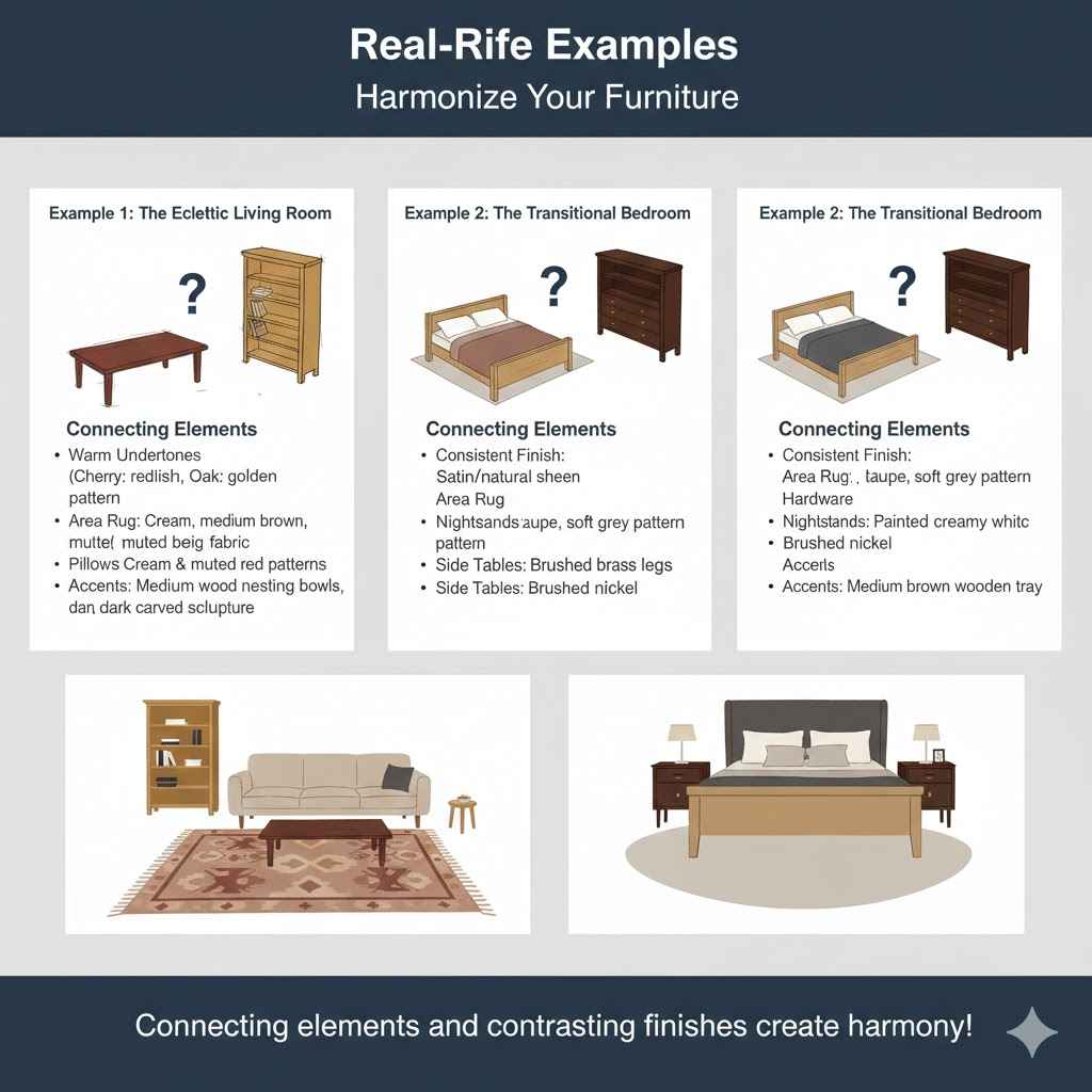
Real-Life Examples
Seeing how these principles work in practice can be very helpful. Let’s look at a couple of scenarios where mixing wood furniture has been done effectively.
Example 1: The Eclectic Living Room
Sarah wanted a cozy, eclectic living room. She had inherited a beautiful, darker cherry wood coffee table with some traditional carvings. She also loved a lighter, almost blonde oak bookcase she found at a flea market.
Initially, she worried they would clash.
To tie them together, she focused on the undertones and used connecting elements. The cherry wood had warm, reddish undertones. The oak had slightly warmer, golden undertones, not cool.
This similarity in warmth was a good start.
Sarah then introduced a large area rug with a pattern that featured cream, a medium brown, and hints of a muted red. The cream and medium brown echoed some of the lighter tones and the general warmth of both woods.
She also chose a sofa in a textured, medium beige fabric and added throw pillows that had cream and muted red patterns. The metal legs of her new side tables were a brushed brass, which complemented the warm cherry and the golden oak.
Finally, she placed a few decorative wooden items on the coffee table and bookcase. One was a set of nesting bowls in a warm, medium wood tone, similar to the oak but slightly darker. The other was a carved wooden sculpture with darker accents that picked up on the cherry table.
The result was a room where the cherry and oak furniture felt intentional and harmonious. The connecting elements – the rug, pillows, and brass accents – created a cohesive feel. The repetition of medium wood tones in the accents further unified the space.
Example 2: The Transitional Bedroom
Mark was designing a master bedroom with a transitional style, aiming for a blend of classic comfort and modern simplicity. He had a solid maple bed frame, known for its light, neutral tone. He also wanted to incorporate a darker wood dresser he already owned, which was a rich walnut.
His initial concern was the significant difference in color and darkness between the maple and walnut. To address this, he focused on the finishes and the overall style. Both maple and walnut, when finished in a relatively natural or satin sheen, can have a timeless appeal that fits transitional decor.
Mark selected a large area rug with a subtle damask pattern in shades of cream, taupe, and a soft grey. This neutral palette acted as a bridge between the light maple and dark walnut. The taupe notes in the rug had undertones that could complement both woods.
He chose nightstands that were a painted finish, in a soft, creamy white. This provided a distinct contrast to the woods and a neutral element that broke up the wood tones. The hardware on the nightstands was a brushed nickel, which introduced a cool metal tone that is often used in transitional design.
To add more depth, Mark introduced a large, upholstered headboard in a deep charcoal grey fabric. This color is a sophisticated neutral that works well with both light and dark woods. He also added accent pieces like a decorative wooden tray on the dresser in a medium brown tone, which was a shade that sat nicely between the maple and walnut.
By using neutral colors, contrasting finishes (painted nightstands), and carefully selected accent pieces, Mark successfully integrated the light maple bed frame and the dark walnut dresser. The room felt balanced, sophisticated, and cohesive, with the woods complementing rather than competing with each other.
FAQ
Question: Can I mix light wood furniture with dark wood furniture?
Answer: Yes, you absolutely can mix light and dark wood furniture. The key is to ensure they have similar undertones or to use connecting elements like metal, fabric, or a dominant neutral color to tie them together. This creates a balanced and visually interesting space.
Question: What are undertones in wood furniture?
Answer: Undertones are the subtle underlying colors within the wood’s main hue. Woods can have warm undertones (red, orange, yellow) or cool undertones (blue, green, gray). Recognizing these helps you pair woods that harmonize, even if their main colors differ.
Question: How many different wood colors should I have in one room?
Answer: It’s generally best to stick to two or three main wood tones in a single room to avoid visual clutter. If you use more, ensure they have strong unifying elements like similar undertones, complementary finishes, or are balanced by neutral colors and materials.
Question: Does the finish of the wood matter when mixing?
Answer: Yes, the finish is very important. A glossy finish reflects light differently than a matte finish. Different stains also add color.
Consider how the sheen and color of the finish will interact with other wood pieces and the overall room design.
Question: What if my furniture is painted wood?
Answer: Painted wood furniture can be a great way to bridge different wood tones. A painted piece, especially in a neutral color, can act as a unifying element that connects various wood finishes without competing with them.
Summary
You can indeed match wood furniture of different colors by understanding undertones, finishes, and using connecting elements. Stick to a few main wood types, repeat tones, and consider scale and style. With these simple strategies, you can create a beautifully layered and harmonious home.