Does Paint Look Lighter Or Darker Than Sample? Essential Guide
Quick Summary:
Paint often appears lighter or darker than its sample due to lighting, surrounding colors, and paint sheen. Always test paint in your actual space under different light conditions before committing to the entire project to ensure the final look matches your vision.
Choosing the perfect paint color can feel like a treasure hunt, and sometimes, the treasure you find isn’t quite what you expected. You pick a beautiful swatch from the store, envisioning it transforming your room, but once it’s on the wall, it looks… different. This is a super common frustration for DIYers, and you’re definitely not alone! It can be disheartening when the color doesn’t match your expectations. But don’t worry, this happens for several good reasons, and understanding them is the first step to getting it right. We’ll break down why paint samples can be deceiving and how you can ensure the color you choose is the color you get. Get ready to paint with confidence!
Why Your Paint Sample Might Look Different on the Wall
It’s a classic head-scratcher: you stare at a small paint chip, then at the large painted wall, and they just don’t seem to be the same color. This isn’t magic; it’s science and perception at play! Several factors can make your chosen paint hue appear lighter or darker than the tiny sample you held in the store. Understanding these influences will save you time, paint, and a whole lot of guesswork.
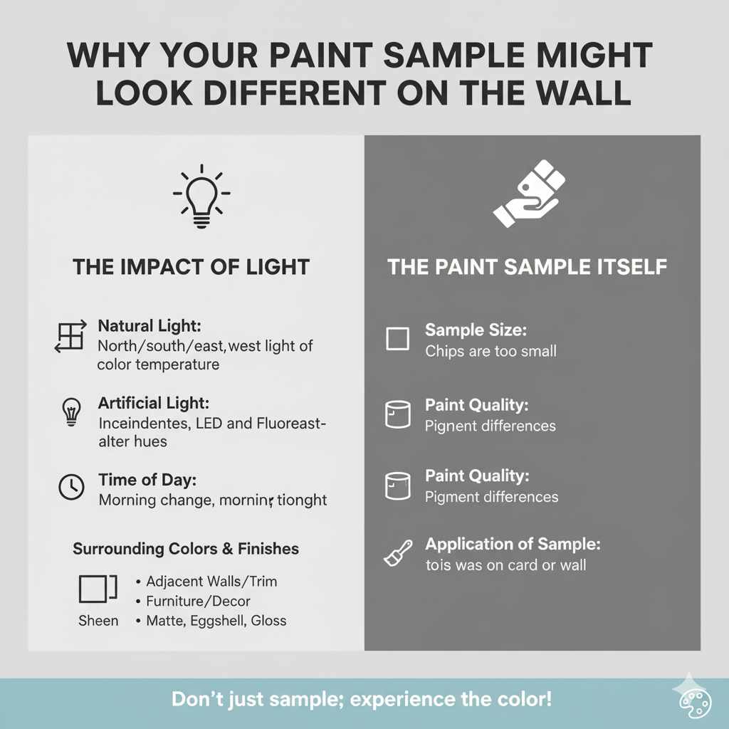
The Impact of Light
Light is arguably the biggest chameleon in the room when it comes to paint color. The lighting in a paint store is usually bright and consistent, often with fluorescent or LED lights that can make colors appear more vibrant and true to their swatch. However, the lighting in your home is unique.
- Natural Light: Rooms facing north tend to get cooler, bluer light throughout the day, which can make colors appear cooler and sometimes a bit darker or more muted. South-facing rooms get warmer, more direct sunlight, which can make colors appear brighter and warmer. East-facing rooms have bright morning light that shifts to cooler afternoon light, while west-facing rooms have softer, warmer light that intensifies in the late afternoon.
- Artificial Light: Incandescent bulbs cast a warm, yellow glow, making colors appear warmer and potentially a bit darker. Halogen bulbs offer a whiter light, similar to daylight. Fluorescent bulbs can vary widely; some have a greenish cast, while others aim for a more neutral light. LED bulbs also come in a range of color temperatures, from warm to cool.
- Time of Day: Even within the same room, a color can look dramatically different from morning to noon to night, depending on how the light hits it. A color that looks perfect in the soft morning light might appear too dark under harsh afternoon sun or dim evening lamps.
Surrounding Colors and Finishes
The colors and finishes of the elements around your painted walls play a crucial role in how a paint color is perceived. This is known as color relativity.
- Adjacent Walls and Trim: If you’re painting a room a specific color, the color of the adjoining rooms or the trim can influence how you see the new paint. A bright white trim next to a color might make that color seem deeper, while a dark wood floor might absorb light and make a wall color appear lighter.
- Furniture and Decor: The colors of your furniture, rugs, curtains, and artwork will interact with your wall color. A bold red sofa might make a neutral wall color seem more subdued, or a large, dark piece of art could create a visual anchor that shifts your perception of the surrounding paint.
-
Sheen: The finish or sheen of the paint itself significantly affects its appearance.
- Matte/Flat: These finishes absorb light, giving a velvety, non-reflective look. They can make colors appear deeper and more saturated but are less durable and harder to clean.
- Eggshell/Satin: These have a slight sheen, reflecting more light than matte. They offer a good balance of durability and appearance, making colors look a bit brighter and richer than matte.
- Semi-Gloss/Gloss: These finishes are highly reflective, bouncing light around the room. They make colors appear much brighter and can highlight imperfections. They are very durable and easy to clean.
- The Size of the Area: A small paint chip is a tiny surface. When you paint an entire wall or room, the sheer volume of color creates a much more immersive experience. This can amplify the color, making it appear more intense. A light color might look washed out on a chip but perfectly soft on a large wall, while a dark color might feel overwhelming when applied to an entire room.
The Paint Sample Itself
Sometimes, the issue isn’t just your environment; it’s the sample you’re working with.
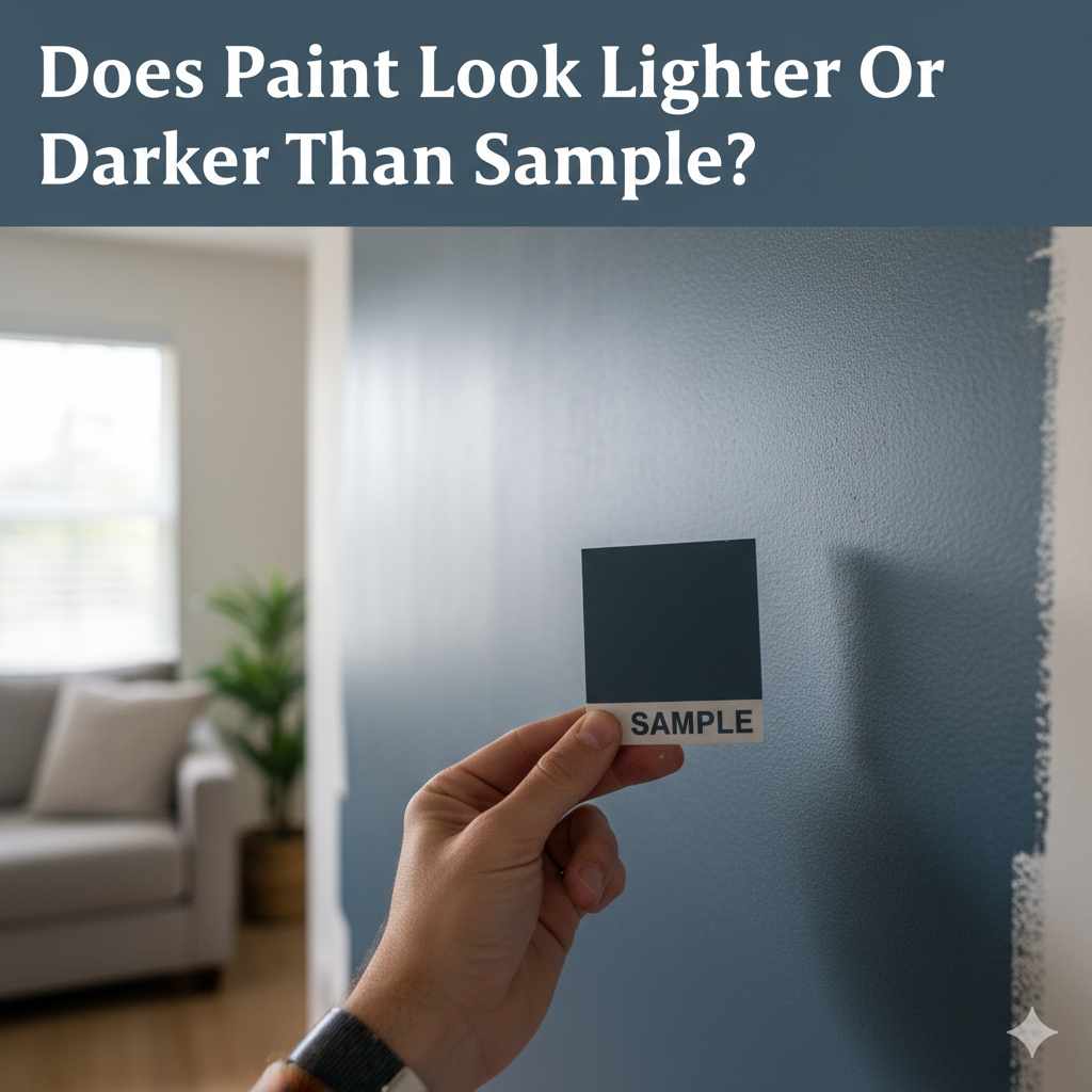
- Sample Size: Paint chips are minuscule! They don’t provide enough surface area to truly understand how the color will behave in a large space. Even the small sample pots, while better, are still limited.
- Paint Quality: The quality of the paint used for the sample might differ from the paint you purchase in a larger quantity. Pigment concentration and binder types can subtly affect the final hue.
- Application of Sample: How the sample was applied can also matter. Was it painted on a thick card? On a white surface? On a colored surface? These all affect how the color reads.
How to Properly Test Your Paint Color
This is where we move from understanding the problem to actively solving it! Testing your paint color correctly is the most crucial step to ensure you love the final result. It’s not just about slapping a bit of paint on the wall; it’s about strategic testing.
Step 1: Get Sample Pots, Not Just Chips
Paint chips are great for initial selection, but they are too small to give you a real sense of the color. Invest in sample pots of your top 2-3 color choices. Yes, it costs a bit more upfront, but it’s far cheaper than repainting an entire room!
Step 2: Choose the Right Testing Location
Don’t just paint one swatch in one spot. You need to see how the color performs in different areas of the room.
- Multiple Walls: Paint swatches on at least two different walls in the room. One that gets direct natural light and one that is more in shadow.
- Near Trim and Other Colors: Paint samples next to your trim color, near doorways, and adjacent to any existing furniture or large decor items you plan to keep. This helps you see how the colors interact.
Step 3: Paint Large Swatches
Forget tiny dots. You need a significant area to get a true feel for the color. A good rule of thumb is to paint swatches at least 1 foot by 1 foot (30 cm x 30 cm), or even larger if possible.
Pro Tip: Paint your swatches on large poster boards or thick cardboard. This has a couple of advantages:
- Flexibility: You can move the boards around the room to see the color in different lighting conditions and next to different elements without repainting.
- No Wall Damage: You don’t have to worry about covering up the swatches perfectly when you’re done or about the underlying wall color showing through.
- Consistent Background: Painting on a neutral white poster board ensures the sample isn’t influenced by the color of the wall it’s currently on.
Step 4: Observe the Color Throughout the Day and Night
This is the most important part of testing. Live with your samples for a few days. Look at them:
- Morning: See how the color looks in the soft, cool morning light.
- Midday: Observe it under the brighter, potentially warmer light of noon.
- Afternoon: Check its appearance as the sun starts to set and the light changes.
- Evening: See how it looks under your primary artificial lighting (lamps, overhead fixtures).
Take photos of the swatches at different times to compare. This will reveal how the color shifts and behaves.
Step 5: Consider the Paint Sheen
If you’re debating between a satin and an eggshell finish, get sample pots in both sheens of your favorite color. The difference in reflectivity can be substantial and might sway your final decision. For example, a dark color might feel too intense in a high-gloss finish but just right in a matte.
Factors That Make Paint Look Lighter or Darker
Let’s break down the specific ways the factors we discussed can influence your perception of the paint color.
When Paint Looks Lighter Than the Sample
Several conditions can cause your chosen paint to appear lighter on the wall than on the small sample chip or swatch:
- Bright, Abundant Natural Light: Rooms flooded with sunlight, especially south-facing rooms, can wash out colors, making them appear lighter and less saturated.
- White or Light-Colored Surroundings: If the trim, ceiling, or adjacent walls are white or a very light neutral, they can create a contrast that makes the wall color seem brighter and lighter than it would otherwise. Think of it like placing a medium gray square next to a bright white square; the gray will look darker than if it were next to a black square.
- Higher Paint Sheen: Glossier finishes reflect more light. A satin or semi-gloss version of a color will almost always appear lighter and brighter than a matte version of the exact same color.
- The “Lightening Effect” of Large Areas: As mentioned, painting a large surface area can sometimes make a color appear less intense and thus lighter than a small chip. This is especially true for lighter colors.
- Cooler Light: North-facing light or artificial lights with a cooler color temperature (like some LEDs or fluorescents) can sometimes make colors appear less warm and therefore, to some eyes, lighter or more “washed out.”
When Paint Looks Darker Than the Sample
Conversely, these factors can make your paint appear darker:
- Low Light Conditions: Rooms with minimal natural light, or rooms that rely heavily on artificial light, will make colors appear deeper and darker. This is also true for east or west-facing rooms during certain parts of the day.
- Dark Surroundings: If the paint is surrounded by dark furniture, dark flooring, or dark trim, it can absorb more light, making the wall color appear deeper and darker by comparison.
- Lower Paint Sheen: Matte and flat finishes absorb light, giving colors a richer, deeper, and sometimes darker appearance compared to their glossier counterparts.
- Warmer Light: Incandescent bulbs or natural light in the late afternoon/evening can cast a warm, yellow tone that can make colors seem richer, deeper, and potentially darker.
- The “Deepening Effect” of Large Areas: While less common than the lightening effect, some colors, particularly deep blues, greens, or grays, can feel more intense and appear darker when covering an entire room compared to a small sample. This can be overwhelming if not anticipated.
- Undertones Becoming Pronounced: In certain lighting, the subtle undertones of a paint color (e.g., a gray with a blue undertone) can become more apparent, making the color read differently and sometimes appearing “off” or darker than expected.
Table: Factors Influencing Paint Color Perception
To help you visualize these effects, here’s a table summarizing the key influencers:
| Factor | When it Tends to Make Paint Look Lighter | When it Tends to Make Paint Look Darker |
|---|---|---|
| Light Source | Bright, direct natural light (e.g., south-facing windows) | Low natural light, shaded areas, indirect light |
| Artificial Light Type | Cool white LEDs, some fluorescents | Warm incandescent, warm LEDs |
| Time of Day | Midday sun | Early morning, late afternoon/evening |
| Surrounding Colors | White, very light neutrals, bright adjacent colors | Dark furniture, dark flooring, dark trim, deep adjacent colors |
| Paint Sheen | Gloss, Semi-Gloss | Matte, Flat |
| Area Size | Small samples (initially) | Large walls can sometimes deepen intense colors |
| Room Orientation | North-facing (cooler light) | East/West facing (changing light), South-facing (intense light can sometimes deepen darker colors by contrast) |
Choosing the Right Sheen for Your Project
The sheen of your paint isn’t just about how shiny it is; it’s about durability, cleanability, and how the color will ultimately appear. Here’s a quick rundown:
-
Flat/Matte:
- Pros: Hides imperfections well, provides a rich, velvety look, excellent for low-traffic areas like ceilings and adult bedrooms.
- Cons: Least durable, difficult to clean, can scuff easily.
- Color Impact: Makes colors appear deeper and more muted.
-
Eggshell:
- Pros: Low sheen, good durability, easier to clean than flat, suitable for most walls in living rooms, dining rooms, and hallways.
- Cons: Still can show some imperfections more than flat.
- Color Impact: A soft sheen that makes colors look rich but not overly bright.
-
Satin:
- Pros: Smooth, velvety sheen, very durable, washable, excellent for high-traffic areas like kitchens, bathrooms, kids’ rooms, and trim.
- Cons: Can highlight imperfections more than eggshell or flat.
- Color Impact: Reflects more light than eggshell, making colors appear slightly brighter and more vibrant.
-
Semi-Gloss:
- Pros: Highly reflective, very durable, excellent for trim, doors, cabinets, and high-moisture areas.
- Cons: Highlights imperfections significantly, can be too shiny for walls.
- Color Impact: Makes colors appear very bright and can look significantly different than a matte version.
-
High-Gloss:
- Pros: Extremely durable, reflective, and provides a hard, shiny finish. Used for dramatic accents, furniture, or high-wear surfaces.
- Cons: Shows every single flaw, requires meticulous surface preparation.
- Color Impact: Makes colors appear the brightest and most intense.
The Environmental Protection Agency (EPA) also offers guidance on choosing paints with lower volatile organic compounds (VOCs), which are better for indoor air quality. While VOCs don’t directly change how a color looks, they are an important consideration for any home improvement project.
Table: Sheen vs. Light Reflection and Durability
Here’s a comparison of paint sheens:
| Paint Sheen | Light Reflection | Durability & Washability | Best Uses |
|---|---|---|---|
| Flat/Matte | Low | Low | Ceilings, low-traffic walls |
| Eggshell | Low to Medium | Medium | Living rooms, bedrooms, hallways |
| Satin | Medium | High | Kitchens, bathrooms, kids’ rooms, trim |
| Semi-Gloss | High | Very High | Trim, doors, cabinets |
| High-Gloss | Very High | Extremely High | Accent pieces, high-wear surfaces |
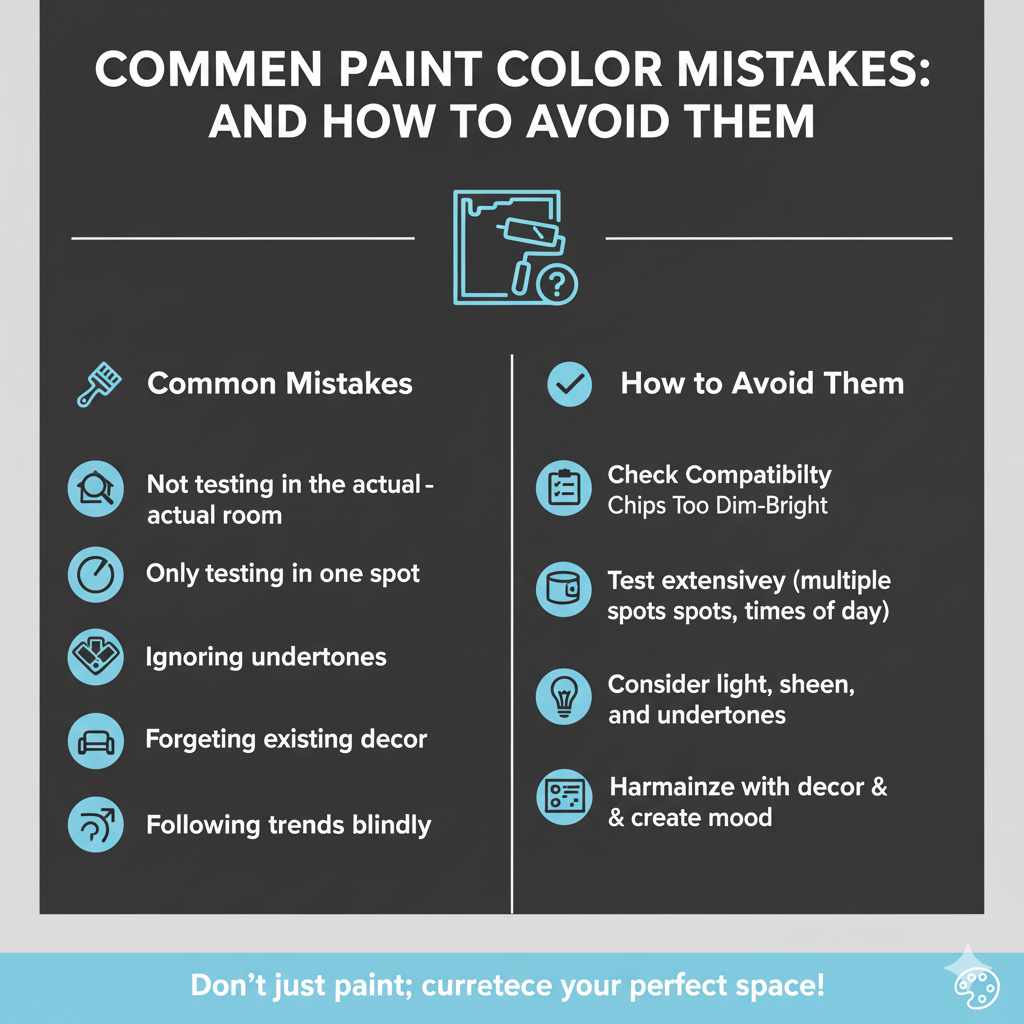
Common Paint Color Mistakes and How to Avoid Them
Even with careful testing, it’s easy to stumble. Here are some common pitfalls:
- Not testing in the actual room: Relying solely on store lighting or small chips is the number one mistake.
- Only testing in one spot: Light varies dramatically across a room.
- Not considering the undertones: A gray might look neutral on a chip but have a strong blue or purple undertone that becomes apparent in your home’s specific lighting.
- Forgetting about existing decor: A new paint color needs to harmonize with your furniture, rugs, and artwork.
- Choosing a color based on trends alone: What looks good on a magazine cover might not work in your unique space.
- Not using enough paint for samples: Tiny dots are insufficient. Go big!
- Ignoring the sheen: A matte finish can make a color feel cozy, while a satin can make it feel energetic.
To avoid these, follow the testing steps meticulously. Think about the mood you want to create. Do you want a calming retreat? A vibrant gathering space? Your color choice, influenced by light and sheen, is key to achieving that atmosphere.
FAQ: Your Paint Color Questions Answered
Q1: Why does my paint look completely different on the wall than it did on the tiny chip?
A1: This is usually due to lighting conditions in your home (natural and artificial), the size of the area being painted (a large wall reflects more light than a small chip), and the colors of surrounding objects. Paint chips are too small to accurately represent how a color will look when covering a large surface under your home’s unique light.
Q2: How large should my paint samples be?
A2: Aim for swatches at least 1 foot by 1 foot (30 cm x 30 cm). Painting on poster board allows you to make them even larger and move them around, which is highly recommended.
Q3: Should I paint the samples directly on the wall?
A3: It’s often better to paint samples on large poster boards or thick cardboard. This way, you can move them to different walls, observe them in various lighting conditions, and see how they look next to your trim and furniture without having to commit to painting directly on the wall or worry about the old color showing through.
Q4: How many days should I leave paint samples up before deciding?
A4: It’s best to observe the samples for at least 2-3 full days. This allows you to see how the color changes throughout the day and night, under different types of natural and artificial light.
Q5: Does the sheen of the paint affect how light or dark it looks?
A5: Absolutely! Higher sheens (like satin or semi-gloss) reflect more light, making colors appear brighter and sometimes lighter. Lower sheens (like matte or flat) absorb more light, making colors appear deeper and often darker or more muted.
Q6: What if I’m painting over a dark color with a light color? Will it look lighter than the sample?
A6: Yes, this is a common scenario where the previous dark color can significantly impact how the new light color appears. The dark base can absorb light, making the new, lighter paint look darker than its sample until you apply a good primer or multiple coats. Testing over a primed surface or seeing how the sample looks over a mid-tone gray can be helpful.
Q7: Can I trust online paint visualizers?
A7: Online visualizers are fun tools for getting a general idea, but they are not a substitute for physical paint samples. Screen calibration, monitor settings, and the software itself can all alter how colors are displayed, making them unreliable for making a final decision. Always test physical paint samples in your home.
Conclusion
Navigating the world of paint colors can feel like a puzzle, but understanding why your paint sample might look different on the wall is the key to solving it. We’ve explored how light, surrounding colors, and the paint’s sheen all play a significant role in the final appearance. The most important takeaway is that a tiny paint chip is just a starting point. By investing a little extra time and a few dollars in sample pots, painting large swatches, and observing them in your home under various lighting conditions over several days, you can confidently choose a color that will truly transform your space exactly as you envisioned. Don’t let the mystery of paint color perception deter you; armed with this knowledge, you’re ready to paint with precision and pride. Happy painting!