

Color Schemes: Unlocking the Power of Palette Perfection
Color schemes refer to a set of colors used in design or art. They include monochromatic, analogous, complementary, split complementary, triadic, square, and rectangle schemes.
These color schemes are essential in creating visually appealing and harmonious designs and can impact user experience, brand differentiation, and brand consistency. Understanding the different types of color schemes helps in choosing the most suitable one for specific design needs.
The right color scheme can enhance readability, create contrast, and set brands apart from competitors. Whether for apps, websites, or home decor, implementing the appropriate color scheme can significantly influence how users perceive and interact with the design.
Types Of Color Schemes
Color schemes play a crucial role in design, evoking emotions and creating visual harmony. Understanding the different types of color schemes can help you effectively communicate your message through colors. Let’s explore seven major types of color schemes:
Monochromatic
A monochromatic color scheme uses variations of a single hue, providing a sleek and minimalist look. It creates a cohesive and harmonious visual experience.
Analogous
Analogous color schemes consist of colors that are adjacent to each other on the color wheel. This scheme offers a pleasing and subtle blend of colors that work well together.
Complementary
In a complementary color scheme, colors that are opposite each other on the color wheel are used. This creates a high-contrast and vibrant visual impact, making elements stand out.
Split Complementary
A split complementary color scheme is a variation of the complementary scheme. Instead of using direct opposites, it involves a base color and two colors adjacent to its complement, offering a balanced yet dynamic aesthetic.
Triadic
The triadic color scheme uses three colors evenly spaced around the color wheel. This scheme ensures a harmonious balance of colors while providing contrast and visual interest.
Square
A square color scheme involves four colors evenly spaced on the color wheel. This scheme offers a vibrant and balanced palette suitable for creating dynamic and visually appealing designs.
Rectangle (tetradic)
The rectangle or tetradic color scheme uses four colors, consisting of two complementary pairs. This scheme provides a wide range of color combinations, allowing for creative and diverse design options
Color Schemes In Design
Color schemes play a critical role in design, encompassing the careful selection and arrangement of colors to evoke specific emotions, convey messaging, and enhance the overall aesthetics of a product or brand. Whether it’s for a website, brand identity, or product design, understanding the impact of color schemes is essential for creating a cohesive and impactful visual experience. Let’s delve into the different aspects of color schemes in design and their significance.
Influence On User Experience
The choice of color scheme directly influences user experience, affecting how users interact with a website, app, or product. Appropriate color usage can evoke specific emotions or guide users’ actions, ultimately enhancing usability and engagement. Implementing a well-thought-out color scheme can improve accessibility and readability, creating an inclusive and enjoyable experience for users.
Branding And Differentiation
Color schemes are a pivotal element in branding, serving as a powerful tool for brand differentiation. Consistent application of brand colors across various touchpoints helps in creating a strong and memorable visual identity. Distinctive color choices can also set a brand apart from its competitors, enabling instant recognition and fostering customer loyalty.
Consistency In Ui Design
Maintaining consistency in the color scheme across a user interface is crucial for establishing a cohesive and harmonious visual experience. It ensures that various components within the interface are visually connected and aids in creating a seamless navigational flow. Consistent application of color schemes fosters a sense of trust with users and reinforces brand recognition.
Color Wheel And Palette
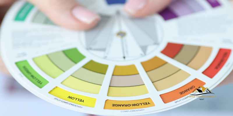
A color wheel and palette are essential tools for designers and artists to create visually attractive and harmonious color schemes. Understanding the color wheel and how to effectively create color palettes can greatly enhance the impact and appeal of any design or artwork.
Understanding The Color Wheel
The color wheel is a circular diagram that represents the relationships between colors. It consists of primary colors (red, blue, and yellow), secondary colors (orange, green, and purple), and tertiary colors (created by mixing primary and secondary colors).
By understanding the color wheel, designers can grasp concepts such as complementary colors (colors opposite each other on the wheel), analogous colors (colors next to each other on the wheel), and triadic colors (three colors evenly spaced around the wheel).
Creating Effective Color Palettes
Creating effective color palettes involves selecting colors that work well together to evoke the desired emotions and convey the intended message. Here are some tips for creating effective color palettes:
- Begin with a dominant color that represents the mood or theme you want to convey.
- Add complementary colors to create contrast and make certain elements stand out.
- Consider using analogous colors for a harmonious and cohesive look.
- Experiment with different shades, tints, and tones of the chosen colors to add depth and visual interest.
- Avoid using too many colors, as it can be overwhelming and distract from the main message.
Remember, when creating a color palette, it’s essential to consider the target audience, the purpose of the design, and the overall brand identity. By following these guidelines, designers can create visually appealing and impactful color schemes that resonate with their audience.
Application Of Color Schemes
Color schemes play a crucial role in applications by making user experiences unique and memorable, while also maintaining brand consistency and fostering trust with users. Different types of color schemes, such as monochromatic, analogous, complementary, and triadic, offer various ways to create visually appealing and cohesive designs.
Color Schemes In Apps

Color Schemes In Home Décor
The application of color schemes plays a crucial role in various aspects of our lives, from the apps we use on our smartphones to the décor in our homes. Understanding how to effectively utilize color schemes can create visually appealing and harmonious designs that capture attention and evoke specific emotions.
Color Schemes In Apps
An app’s color scheme holds significant importance as it contributes to creating a user experience that is both familiar and memorable. By carefully selecting colors that align with your brand identity, you can set your app apart from competitors and establish a unique visual style that resonates with your target audience.
Not only does a well-thought-out color scheme enhance brand consistency, but it also fosters trust with users. The colors you choose impact the readability of text and navigation within your app, ultimately influencing user engagement and satisfaction.
Color Schemes In Home Décor
When it comes to home décor, color schemes play a vital role in establishing the overall ambiance and style of a space. Choosing the right color palette for different rooms can create a harmonious and visually appealing environment that reflects your personal taste and preferences.
There are various types of color schemes that can be applied in home décor, such as monochromatic, analogous, complementary, triadic, and tetradic. Each scheme offers a unique way of combining colors to create a specific mood or atmosphere in a room.
A monochromatic color scheme, for example, uses varying shades and tints of a single hue, creating a cohesive and calming effect. On the other hand, a complementary color scheme pairs colors that are opposite each other on the color wheel, resulting in a dynamic and contrasting look.
By understanding the different types of color schemes and their effects, you can choose the right combination of colors for each room in your home to create a visually pleasing and harmonious space.
Choosing The Right Color Scheme
Color plays a pivotal role in evoking emotions, sparking interest, and creating an identity. Whether for websites, apps, or interior design, selecting the right color scheme is a crucial decision that can significantly impact the overall impression and functionality. Here, we delve into the art of choosing the right color scheme for different applications.
For Websites And Apps
The color scheme of a website or app is pivotal in shaping user experience, establishing brand recognition, and conveying information. Here are the key factors to consider when choosing a color scheme:
- Accessibility: Ensure that the chosen colors are visually accessible to all users, including those with visual impairments.
- Brand Identity: Align the color scheme with the brand’s identity and values to foster recognition and cohesion.
- Emotional Impact: Understand the psychological effects of different colors and utilize them to evoke specific emotions or responses from the users.
- Usability: Opt for a color scheme that enhances readability, navigability, and overall usability of the website or app.
For Interior Design
When it comes to interior design, the right color scheme can transform a space, creating the desired ambiance and visual appeal. Consider the following factors for selecting a suitable color scheme:
- Space Functionality: Tailor the color scheme to complement the functionality and purpose of the space, whether it’s a living area, workspace, or relaxation zone.
- Lighting: Account for the natural and artificial lighting of the space to ensure the colors appear as intended and create the desired atmosphere.
- Mood and Theme: Select colors that resonate with the desired mood and theme of the space, whether it’s a serene sanctuary, vibrant social area, or professional setting.
Tools For Color Scheme Generation
When it comes to creating visually appealing designs, color schemes play a crucial role. Tools for color scheme generation can assist designers in finding the perfect combination of colors that harmonize and enhance their projects. Let’s explore some popular tools for color scheme generation below:
Coolors Palette Generator
Coolors is a super-fast color palettes generator that allows users to create the perfect color scheme or get inspired by thousands of beautiful color palettes. With Coolors, designers can easily experiment with different color combinations to find the ideal palette for their designs.
Adobe Color Palette Generator
The Adobe Color Palette Generator, also known as Adobe Color CC, is a versatile tool for creating color schemes. Designers can explore various color harmonies, save favorite color schemes, and even extract colors from images to build custom palettes. Adobe Color makes it easy to transfer color schemes to other Adobe Creative Cloud applications for seamless design integration.
Color Scheme Trends
Color schemes play a crucial role in design and have the power to evoke emotions, convey messages, and create captivating visual experiences. Stay updated on the latest color scheme trends to ensure your designs remain fresh, appealing, and relevant. Let’s delve into the popular color palettes and emerging color trends that are making waves in the design world.
Popular Color Palettes
When it comes to popular color palettes, certain combinations continue to dominate the design landscape. Here are a few noteworthy color schemes that have stood the test of time:
- Monochromatic color schemes that utilize varying tints and shades of a single color
- Analogous color schemes, where colors adjacent to each other on the color wheel are harmoniously paired
- Complementary color schemes, featuring colors that are positioned opposite to each other on the color wheel to create striking contrast
- Triadic color schemes that incorporate three evenly spaced colors on the color wheel to achieve a balanced yet dynamic look
- Split-complementary color schemes that offer a twist on the traditional complementary scheme by using adjacent hues of one complementary color
- Tetradic color schemes, also known as rectangle color schemes, which involve a combination of four colors in a rectangular configuration on the color wheel
Emerging Color Trends
In the ever-evolving world of design, new color trends continuously emerge, reflecting the shifting preferences and moods of society. Keeping abreast of these emerging color trends can set your designs apart and infuse them with a contemporary edge. Some of the standout emerging color trends include:
- Experimental color palettes that defy traditional norms and embrace unconventional combinations to spark interest and creativity
- Nature-inspired hues such as earthy browns, serene greens, and soothing blues, evoking a sense of calm, sustainability, and connection to the environment
- Soft, pastel tones that exude a gentle and soothing vibe, appealing to the desire for tranquility and comfort
- Bold and vibrant color schemes that make a statement, inject energy, and captivate attention, reflecting an optimistic and daring outlook
- Minimalistic monochrome palettes that employ neutral shades to convey simplicity, sophistication, and timelessness

Frequently Asked Questions
What Are The 7 Major Color Schemes?
The 7 major color schemes are monochromatic, analogous, complementary, split complementary, triadic, square, and rectangle (or tetradic). Each type of color scheme has its unique attributes.
What Are The Four 4 Types Of Color Scheme?
The four types of color scheme are monochromatic, analogous, complementary, and triadic. These schemes help create harmony and contrast in design.
What Are The 6 Colour Schemes?
The 6 color schemes are monochromatic, analogous, complementary, split complementary, triadic, and rectangle (or tetradic).
What Is A Color Scheme?
A color scheme refers to the combination of colors used in a design or visual composition. It helps create a sense of harmony and cohesion in the overall aesthetic. There are various types of color schemes, such as monochromatic, analogous, complementary, and triadic.
Conclusion
Color schemes play a crucial role in design and branding, offering various options such as monochromatic, analogous, complementary, and more. Effective use of color schemes can enhance user experience and brand recognition. Understanding the different types of color schemes allows for creation of visually appealing and impactful designs.